For another competition

Posted 17/03/2012 - 11:25
Link
Landscape isn't something I often do, so this is purely a personal opinion with no technical basis.
I think they are all very good. If I had taken them I'd probably be most pleased with number 3, but prefer number 2 from an artistic point of view.
That may simply be because I prefer a landscape shot in landscape format. I suspect I'd go for number 3 if it was the same format as number 2!
Chris
I think they are all very good. If I had taken them I'd probably be most pleased with number 3, but prefer number 2 from an artistic point of view.
That may simply be because I prefer a landscape shot in landscape format. I suspect I'd go for number 3 if it was the same format as number 2!
Chris

Posted 17/03/2012 - 11:26
Link
I'm certainly no expert judge but it would definitely be the first for me for the following reasons...
excellent foreground detail, nicely balanced, great lighting
The others are nice enough but don't have as many strong elements as the first for me, unfortunately with competitions though you never really know what the judges are looking for, good luck !!
Simon
excellent foreground detail, nicely balanced, great lighting
The others are nice enough but don't have as many strong elements as the first for me, unfortunately with competitions though you never really know what the judges are looking for, good luck !!
Simon
My website http://www.landscapephotographyuk.com
My Facebook page http://www.facebook.com/landscapephotographyuk
Find me on Google+ link
My Facebook page http://www.facebook.com/landscapephotographyuk
Find me on Google+ link

Posted 17/03/2012 - 11:32
Link
My favourite shot is the first although I would tone down the highlights top right.

Posted 17/03/2012 - 11:32
Link
My thoughts in reverse order
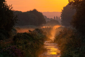
#4. Nice interest from the grass in the front and good lead in from the wall but it does not go any where in particular. So I don't have a focal point in the distant haze.
#3 I Love the muted colours and the reflections, getting them in is the reason for the portrait mode, I assume. However that makes it seem too cropped I would like to see more of the slope of the hill and the trees on the right.
#2 Can't get away with that one.
#1 Is the one I prefer. Good colour and interest from the rocks in the foreground. The gap in them leads into the picture, to pick up the four coloured pebbles, the stark posts and the sky. Also the dark cloud naturally to stop your eye drifting out at the top of the image.
#4. Nice interest from the grass in the front and good lead in from the wall but it does not go any where in particular. So I don't have a focal point in the distant haze.
#3 I Love the muted colours and the reflections, getting them in is the reason for the portrait mode, I assume. However that makes it seem too cropped I would like to see more of the slope of the hill and the trees on the right.
#2 Can't get away with that one.
#1 Is the one I prefer. Good colour and interest from the rocks in the foreground. The gap in them leads into the picture, to pick up the four coloured pebbles, the stark posts and the sky. Also the dark cloud naturally to stop your eye drifting out at the top of the image.
Barrie - Too Old To Die Young
https://pentaxphotogallery.com/artists/barrieforbes
https://www.flickr.com/photos/189482630@N03/
https://pentaxphotogallery.com/artists/barrieforbes
https://www.flickr.com/photos/189482630@N03/

Posted 17/03/2012 - 12:59
Link
Hi Shaun - gotta be #3 for me - beautiful composition,lots of depth and colour and the reflections are amazing.1,2,4 are great shots in differing areas - but the 3rd is my favourite............
Regards
Tony
Regards
Tony
K20D,*istD ( now a dedicated M42 digital ),K100D,MZ5N,P50,ME Super,Spotmatic 1000,Spotmatic,ESII,ES,H2.18-55 II,18-55,75-300 FAJ,35-80 FA,80-200 F,28-105 FA,Sigma 24-70 AF Aspherical,Sigma 28-300 Hyperzoom , Praotor II 500 M42,Centon 500mm mirror,and a few Pentax M42 Taks,super-Taks,smc Taks,A and M lenses.Benbo trekker,7dayshop monopod and a Lowepro rucksack.
I am now on Flickr which is nice !
I am now on Flickr which is nice !

Posted 17/03/2012 - 13:45
Link
Hi Shaun
I have spent some time comparing the merits of each - Totally agree with Barrie about #2 - not a bad shot - but "filler" in this collection.
At first glance #1 is a stunner - has first impression 'wow factor' however - the more I look at at - the more I conclude that the foreground and back are superb but the mid ground doesn't do it for me.
#4 - classic composition, a great shot, but no wow factor.
#3 - Wow - hits you right between the eyes - the muted colours - the clarity of the air and water, the sharp reflection of the trees, the symmetry - even the portrait crop works for me in this one. This one keeps me looking
Which is all a very long winded way of saying #3 for me - stunner
Carl
I have spent some time comparing the merits of each - Totally agree with Barrie about #2 - not a bad shot - but "filler" in this collection.
At first glance #1 is a stunner - has first impression 'wow factor' however - the more I look at at - the more I conclude that the foreground and back are superb but the mid ground doesn't do it for me.
#4 - classic composition, a great shot, but no wow factor.
#3 - Wow - hits you right between the eyes - the muted colours - the clarity of the air and water, the sharp reflection of the trees, the symmetry - even the portrait crop works for me in this one. This one keeps me looking
Which is all a very long winded way of saying #3 for me - stunner
Carl
No matter how many lenses I have owned - I have always needed just one more

Posted 17/03/2012 - 13:45
Link
All good, Shaun - however, number 3 is the one that leapt out at me! One thing I always try to do is trust my gut instincts, even if they're wrong, which is seldom - so DEFFO # 3!!
My thinking is that, if you divide #3 into 3 horizontal elements, then subtract the top and bottom 3rd, then concentrate purely on the middle 3rd, it says "hello!.. I'm a b/w photo!".. Now factor in the top and bottom elements again, and they seem to be telling the middle 3rd, "no you're not!".. Does that make any sense to you, or should I get back to watching Dundee Utd giving Rangers a going over whilst I enjoy a nice cold one?
My thinking is that, if you divide #3 into 3 horizontal elements, then subtract the top and bottom 3rd, then concentrate purely on the middle 3rd, it says "hello!.. I'm a b/w photo!".. Now factor in the top and bottom elements again, and they seem to be telling the middle 3rd, "no you're not!".. Does that make any sense to you, or should I get back to watching Dundee Utd giving Rangers a going over whilst I enjoy a nice cold one?

Posted 17/03/2012 - 14:25
Link
Well - I'm the idiot here , still can't take a decent photo.
However my words and reasoning , if it's worth anything
# 1 I LOVE it - the shafts of light are spectacular , the rocks at the front - wonderful texture there. Enjoy looking more closely and differentiating the various colours on the rocks going right to the back. I'd love to see a big version of this , just for the detail in it.
# 2 nice colours - a great sense of peace but it still makes me think 'what else ? ' I want more - but there isn't anything - it's a bit meh
# 3 WOW just look at those reflections - a real mirror image . Beautifully spotted . Such a sense of stillness
# 4 your eye is led to the top right hand corner slowly as you look at it , beautiful but ...
Summing up , as if you hadn't already guessed #s 1 & 3 for me , and my idiot mind says # 1 because though I can't get anywhere near it - it's the shot I'd love to have taken - it's stunning , it's so well observed , there's all that detail that asks you to look more closely at it .
However my words and reasoning , if it's worth anything
# 1 I LOVE it - the shafts of light are spectacular , the rocks at the front - wonderful texture there. Enjoy looking more closely and differentiating the various colours on the rocks going right to the back. I'd love to see a big version of this , just for the detail in it.
# 2 nice colours - a great sense of peace but it still makes me think 'what else ? ' I want more - but there isn't anything - it's a bit meh
# 3 WOW just look at those reflections - a real mirror image . Beautifully spotted . Such a sense of stillness
# 4 your eye is led to the top right hand corner slowly as you look at it , beautiful but ...
Summing up , as if you hadn't already guessed #s 1 & 3 for me , and my idiot mind says # 1 because though I can't get anywhere near it - it's the shot I'd love to have taken - it's stunning , it's so well observed , there's all that detail that asks you to look more closely at it .
let the education continue
proud owner of a couple of cameras and a few bits and bobs
proud owner of a couple of cameras and a few bits and bobs

Posted 17/03/2012 - 14:44
Link
Four photos to be proud of - each one of them very good
From a pure landscape point I think it would have to be No. 3 - great composition, spot on exposure and a lovely feeling of atmosphere.
However No. 2 is the one I'd have hanging on one of my walls! I just love the bleak simplicity of it.
From a pure landscape point I think it would have to be No. 3 - great composition, spot on exposure and a lovely feeling of atmosphere.
However No. 2 is the one I'd have hanging on one of my walls! I just love the bleak simplicity of it.
Posted 17/03/2012 - 15:19
Link
Hi Shaun- like the new avatar. I it has to be between 1 and 3. The others are good but not as good.
I reckon you would do well with either- #1 has a good composition and wonderful sky but I do think it loses impact in the middle of the picture
Number 3 is less dramatic but is wonderfully serene and i love the pallet.
#3 for me by a whisker. Good Luck
I reckon you would do well with either- #1 has a good composition and wonderful sky but I do think it loses impact in the middle of the picture
Number 3 is less dramatic but is wonderfully serene and i love the pallet.
#3 for me by a whisker. Good Luck
Posted 17/03/2012 - 15:20
Link
Mark-B wrote:
However No. 2 is the one I'd have hanging on one of my walls! I just love the bleak simplicity of it.
Thanks goodness for that......I was feeling a little out-voted However No. 2 is the one I'd have hanging on one of my walls! I just love the bleak simplicity of it.
Just assumed I had no eye for a photo at all.........

Posted 17/03/2012 - 15:32
Link
Tough choice, Shaun, especially when uploaded at such a small size. Having said that, I had no difficulty in eliminating 2 and 4 from the mix but find it hard to chose between 1 and 3.
I think Dr 'O' has highlighted the main 'weakness' of 1, but that area of highlight seems, IMO, to be 'blown' beyond the point of recovery. Wold it be possible to crop differently so as to remove it from the final image whilst retaining the same aspect ratio?
On balance, and by not much more than a 'gnat's whisker', I tend to favour 3. It may not be quite so arresting as 1, but it rewards the viewers eye handsomely on closer and more leisurely inspection.
Jon
Warning: the author of this critique has been officially diagnosed as suffering from a 'talent deficit'
I think Dr 'O' has highlighted the main 'weakness' of 1, but that area of highlight seems, IMO, to be 'blown' beyond the point of recovery. Wold it be possible to crop differently so as to remove it from the final image whilst retaining the same aspect ratio?
On balance, and by not much more than a 'gnat's whisker', I tend to favour 3. It may not be quite so arresting as 1, but it rewards the viewers eye handsomely on closer and more leisurely inspection.
Jon
Warning: the author of this critique has been officially diagnosed as suffering from a 'talent deficit'

Posted 17/03/2012 - 15:46
Link
hi Shaun,
here is the order of my preferences ..
1) no. 3 (my most preferred, for its clearness and finesse)
2) no. 2 (excellent compo, but vignettes bother me)
3) no. 1 (OK but only bottom third keeps attention)
4) no. 2 (excellent spot but bg needs clearness)
best wishes ..
here is the order of my preferences ..
1) no. 3 (my most preferred, for its clearness and finesse)
2) no. 2 (excellent compo, but vignettes bother me)
3) no. 1 (OK but only bottom third keeps attention)
4) no. 2 (excellent spot but bg needs clearness)
best wishes ..

Posted 17/03/2012 - 17:27
Link
My order of preference:
1. No.2 Really atmospheric, would lose the vignettes though. Yes, I would have it on my wall as well.
2. No.3 Beautiful, though the cloud reflection is a bit dominant.
3. No.4 Nice light, though the colours look a bit warm to me.
4. No.1 Very well executed - but any landscape competition will be packed with pics with crisply rendered boulders in the foreground.
1. No.2 Really atmospheric, would lose the vignettes though. Yes, I would have it on my wall as well.
2. No.3 Beautiful, though the cloud reflection is a bit dominant.
3. No.4 Nice light, though the colours look a bit warm to me.
4. No.1 Very well executed - but any landscape competition will be packed with pics with crisply rendered boulders in the foreground.
Regards, Philip
Add Comment
To leave a comment - Log in to Pentax User or create a new account.



1563 posts
16 years
Ive picked and got it down to these four?
Thanks for the help puma (Shaun)
1.
2.
3.
4.
Thanks again