All Forum Comments

Numbers 4 & 6 for me, no obvious PP, unlike the ones in flight.
Comment by Glowingblue posted on Barn Owl at 03/06/2014 - 16:34
X2
Smeggypants wrote:
First thing I saw was the watermark
First thing I saw was the watermark
Comment by Glowingblue posted on phone at 22/05/2014 - 22:11
Smeggypants wrote:
I haven't seen one image taken on a K-3 that was any better than one taken on a K-5 or K-5II(s)
I'm afraid I agree with the Smegster I haven't seen one image taken on a K-3 that was any better than one taken on a K-5 or K-5II(s)
Comment by Glowingblue posted on worth upgrade k5IIs to K-3 at 21/05/2014 - 10:27
SOLD to Darren Moon
Comment by Glowingblue posted on F.S. PENTAX K-01 at 21/05/2014 - 10:08
Colour for me I'm afraid, leave black & white for the oldies, treasure every nuance of colour,
Comment by Glowingblue posted on Framed by a chair at 20/05/2014 - 21:03
Mint, no marks, screen clean.
Comes with brand new PENTAX battery, 64gb card (micro and adapter) but no charger.
I have been using K5 charger.
No original box but will be packaged super safely
Actuations 7727
£120 inc UK Signed For.


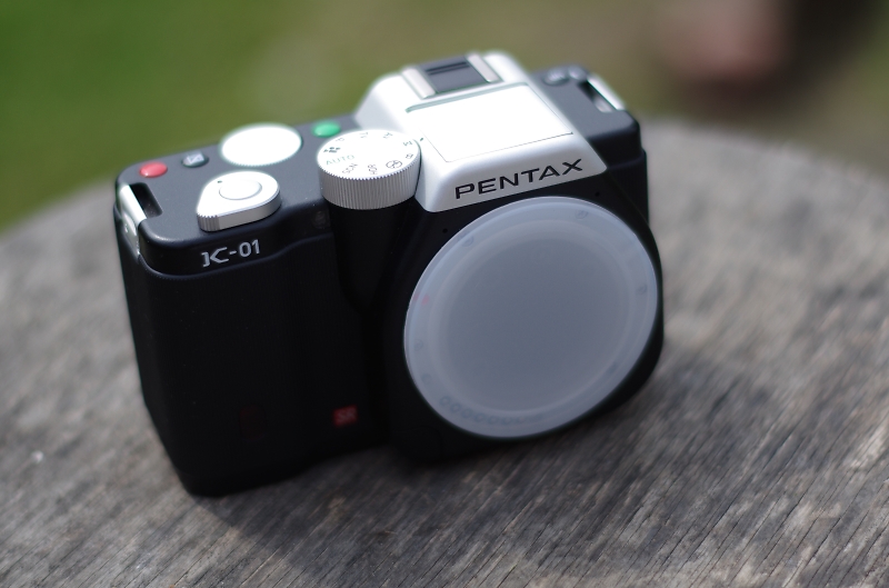

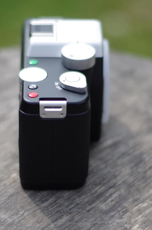
Comes with brand new PENTAX battery, 64gb card (micro and adapter) but no charger.
I have been using K5 charger.
No original box but will be packaged super safely
Actuations 7727
£120 inc UK Signed For.


Comment by Glowingblue posted on F.S. PENTAX K-01 at 20/05/2014 - 14:41
He's beautiful, although he does remind me of Delboy
Comment by Glowingblue posted on New grandson at 19/05/2014 - 19:49
'Also that someone who works in graphic design likes it a lot is really pleasing, thanks Glowingblue.'
My opinions vindicated, I will sleep easy - goodnight folks
My opinions vindicated, I will sleep easy - goodnight folks
Comment by Glowingblue posted on Book Cover Project at 18/05/2014 - 23:26
Thank you
kiwao wrote:
Glowingblue wrote:
Having difficulty making the links!
click on the lower imgp in both cases and you will get to the linkHaving difficulty making the links!
Comment by Glowingblue posted on Are these circular highlights ok? at 18/05/2014 - 20:17
Pass the salt
ronniemac wrote:
I am not a graphic designer so maybe my comments should be taken with a pinch of salt. Still if it's feedback you want....
There is too much going on in the image and that's even without the text being added. Best to work the two together rather than include text as afterthought - the point has already been made.
I'm not sure what has happened in post processing, but the outcome has the overdone HDR effect, especially in the foreground and clouds.
Duplicating the ghost characters does not work, I would tend to have just one version of each and to handle the transparency with great subtlety - they might only be visible on close inspection.
The relationship between central character and ghosts is critical - I wonder if they should all be looking directly at him. If the image had other people in the frame who were clearly unaware of the ghosts presence the central issue of the narrative would be even more self evident - but it might become too busy. In Sixth Sense (?), ghosts were always looking at the boy (the only person who could see them).
Is there significance to the building far left - it looks like a municipal toilet block, but the context of garden or park land works well.
I am sure there is significance in torn trousers and hair over the face, but if not maybe it's not the best portrait of the central character. What is he looking at what is the expression on his face.
These comments apart, I do like a lot about the image - black and white is better by far, and it is good that it is an everyday scene (rather than the clichéd cemetery)
Comment by Glowingblue posted on Book Cover Project at 18/05/2014 - 18:20