Selective Colour in B&W Images

Posted 25/08/2013 - 23:34
Link
You guys have also hijacked the OP's thread, so please start this again as a new thread.
Best regards, John

Posted 27/08/2013 - 07:19
Link
swarf wrote:
I spotted this tree growing in Crotia and liked the look of it for a potential "selective colour" B&W image. I'd welcome comments on both the approach and the result!
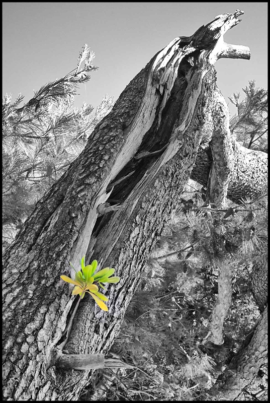
I think that the coloured leaf is lost in the shot. Whilst colour popping can be used to good effect by drawing the viewers eye to the popped element, in this case the B&W tree trunk still draws the viewers eye away from the smaller new growth leaf. Nice sharp image, and good clean pop.I spotted this tree growing in Crotia and liked the look of it for a potential "selective colour" B&W image. I'd welcome comments on both the approach and the result!

Regards, Walter

Posted 27/08/2013 - 15:44
Link
I'm not sure what all the fuss is about. I quite like this shot, I've seen a lot far worse examples of colour-popping. Personally I think the tree might look better partially saturated, but I don't mind it as is. However, the eye does tend to be drawn away up the tree trunk, and for that reason alone it doesn't work for me.
Most clichés become such because they were a good idea in the first place. It's only repetitiveness and over-familiarity that turn them into clichés.
Saying that, if I never see another colour-popped London bus or phone box it'll be too soon. Or another long exposure of Derwent Water.
Most clichés become such because they were a good idea in the first place. It's only repetitiveness and over-familiarity that turn them into clichés.
Saying that, if I never see another colour-popped London bus or phone box it'll be too soon. Or another long exposure of Derwent Water.

Posted 27/08/2013 - 19:10
Link
I just wish I knew how to do it!


Posted 27/08/2013 - 23:37
Link
I quite agree about so called 'cliches'. There are so many images now published that everything could be regarded as a cliche. There will always be room for an excellent example of anything.
As for the original invitation to comment upon the approach and result. I think colour popping has a place but it isn't with this image. I think the composition is good enough to focus the attention firmly on the mistletoe(?) and I think the additional colour popping is unnecessary and too much of a gimmick in this context.
As for the original invitation to comment upon the approach and result. I think colour popping has a place but it isn't with this image. I think the composition is good enough to focus the attention firmly on the mistletoe(?) and I think the additional colour popping is unnecessary and too much of a gimmick in this context.
Add Comment
To leave a comment - Log in to Pentax User or create a new account.




3312 posts
18 years
Durham,
England
David - I agree with Barrie - a little brighter please.
I might also be tempted to try blurring the tunnel portal a bit more, as I find my eye drawn to it and in particular to the "No walking" access signs.
Phil
David