Weekly Competition No 8 - "Reflection"

Posted 28/08/2007 - 19:55
Link

Best regards.
________________
Dirk TROTTEYN.
K10D+ Sigma 18-50 1:2.8 EX DC Lens.
Posted 29/08/2007 - 00:52
Link


Posted 29/08/2007 - 20:55
Link
A graylag goose at Hare Hill, Cheshire

Good luck to all entrants - I won't be here to see the results. Can they kept for a week? Please.
Howard

Good luck to all entrants - I won't be here to see the results. Can they kept for a week? Please.
Howard
Cymru Am Byth

Posted 30/08/2007 - 12:07
Link

F4.5, 1/20 - Iso 800 at 43mm (using standard kit lens) Very dark room - but with sun in the mirror - first public sharing

Posted 31/08/2007 - 10:04
Link
Don't have a tripod yet, so I was struggling a bit shooting this one hand held.


Gordon
---------
K10D
---------
K10D


Posted 31/08/2007 - 20:01
Link
"Rose" in the small harbour at John'O'Groats, Scotland.


Posted 02/09/2007 - 23:57
Link

Posted 03/09/2007 - 10:55
Link
The competition is now closed, and I'll be posting my judgement this evening...
Thanks for all your entries, this is going to be a tricky one.
Dan
Thanks for all your entries, this is going to be a tricky one.
Dan
K-3, a macro lens and a DA*300mm...
Posted 04/09/2007 - 00:20
Link
Here we go, sorry for the lateness, but this judging lark takes a while...
Justgetoutandride: I prefer this with the bottom 1/4 cropped off, as I don't like the look of the flower pot. Although this gives it context, presumably at the side of a pond, I prefer the abstract area, so cropping it just above the dark thing on the left hand side improves it a lot for me.
Bettyswolloks: I like this, the grey sky suits the subject, which makes me think of waste ground, a bit bleak. I like the way the reflection is broken, as well as the mirror. Highly Commended.
Drerka: I'm not keen on the murky, brown colour of the reflection, which is a shame because that puts me off before I've really studied the picture, and it's hardly your fault. However, with some better lighting I think this would have been a cracker, either broken cloud, or sunset/sunrise - the flat sky doesn't really do anything for the pic for me.
Wintoid: Well, the reflection isn't the biggest element of this picture (that honour goes to Chris Eubank's ego :lol. In some ways I like it, in others I don't. I like the concept, but the composition doesn't work for me, I think you could have gone closer in, or looked for some more dynamic angles.
Lenscape: So here we have the reflected light from the entrance, as well as it being a good place to go and reflect. There's a lack of sharpness, but I'm not sure if that's shallow DoF, camera shake, or just the resizing. Also feel a bit disconcerted - I get the impression that the image is wonky, but not sure how, think it might be diverging verticals instead. That doorway just doesn't look right to me.
Clarky: This is well thought out and lit, much better than your entry for the self-portrait. Not keen on the yellow thing the lens is resting on and the background behind the lens is a bit distracting for me. Highly Commended.
Prieni: Now this is an odd one for me. I don't like sloping horizons, but as this is so obviously 'off', it works. I like the diagonal composition, but not sure if the boat and 'drain-pipe' adds anything to it. Nice colours, the reds and oranges go well with the deep blue, but the fall off in contrast and colour on the left hand side, as you're looking more steeply into the water, takes a little away from the image, I feel.
Davem: That boat really stands out, the colours are so vivd, and I guess that's what attracted you to it. Unfortunately the pic slopes to the right, and sloping horizons are a real bugbear of mine...
George Lazarette: A picture from George! And a good one too. It's not good enough to win, but I think it proves he's not just all mouth. I love the iris, the reflection (the quality of it, not necessarily the subject), the iridescence, stunning detail in the whites of the eye, but who did the make-up? Was it a bricklayer? I do find the mascara detracts from an otherwise good pic. I'm guessing everyone's had a good, close look at this one? Highly Commended.
Johnriley: When I looked at this earlier in the week I thought, nice, but crop that half a figure off the right hand side, and perhaps centralise the composition more. When I looked today, I believe John has (unless I dreamed it last week). So now this is a very pleasing, abstract image, with strong colours. But, it's the orange trousers that spoil it a bit for me, they really grab my attention and I think the pic looks better overall without those trousers - try it just by covering the orange with a strip of white paper.
Zach Abubeker: Well exposed, with a good range of blues and whites, but I think I've just seen too many of this sort of shot for it to stand out as a winner.
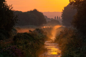
Kevin Stephens: Text book lake reflection! Very nicely done, if you've used an ND Grad it doesn't show, and the disturbed water in the distance nicely breaks up the distant shore and the reflection. Amazingly calm for what looks like fairly late in the morning. Only criticisms are that the sky's a little too bright for me, and it's a bit hazy, reducing the contrast, but then this gives the shot depth, as you can clearly see the 'distance'. Third Place.
Gartmore: An excellent, moody, abstract shot. Well seen at the time, it's that combination of reflection and view through the window that grabs you. Second Place.
Ratcatcher: If this wasn't taken in the mirror, would you have taken this picture? What I mean is, if you were stood where the mirror is, looking at the lamp, thermostat, pictures etc., would you have thought "Now there's a photo!". Doesn't do anything for me I'm afraid.
Dirk1000: Another intersting shot, because we can look at it as either a reflection of the sun striking Dirk's face, or that he's reflecting on the beauty of the Tucuman countryside. Or both. Nicely composed and exposed, I am however a little put off by the look of the image around Dirk, not sure if it's been heavily burnt-in or if it's a composite.
Legasso: Similar shot to Ratcatcher's, but with a more interesting subject. Still doesn't really excite me though, but I have to admit it ticks all the 'reflections' boxes.
HowardJ: I like Greylags much more than Canada Geese, so we're off to a good start, but I find this pic falls a little short of a good one. The reflection needs to be stronger, and this would have been easier if the lighting was more contrasty. Ideally get a nice dark background (with no direct light on it), and get down a bit lower, but not a bad shot.
Nimitz: The focus is on the mirror, rather than the woman, and I'd prefer not to have the man in the background. I think this could have been a nice set-up shot, but as a grab shot I'm guessing this is the best that could have been achieved. Exposure's good for the lighting.
Browngo1: You're right, it's a bit blurred which I find spoils an interesting shot. Nice use of the diagonal, but if you shot it specifically for this entry, then I think you could have afforded to up the ISO to get a sharper shot - at this size on the web we wouldn't have seen the noise.
Lilly: Just beautiful, I love the colour and the patchy reflection, exposure's spot on, such a vivd picture that grabs you as soon as you see it. The reflection of the person is perfectly placed over the red area, just brilliant balance to it. My Winner of the Week!
Galoot: Can't give him another win, so I'm going to pick this one to bits! Actually, I like this, the colours, the calm look of it, it's a restful picture with a good reflection. A little too good perhaps... Galoot, where's that lump gone from the front of the boat, just above the dark paint? Was it really that horrible? And the cloning is a bit shoddy. Hang on, even the ropes not real! Repeating patterns not good... Bottom of the class for you!
Viewfinder: This looks flat to me, as if you've taken the contrast right down. It's got a greyish tone overall, which doesn't seem to suit the subject, which looks as though it should be warm and chocolate boxy. Depth of field looks a little shallow too, the trees in the distance are a little blurry, and this sort of shot wants front to back sharpness in my opinion.
Well there you have it, I'm handing the reins over to Lilly, who I think has been unlucky in previous competitions, but has come up trumps here. Well done Lilly!
And I'll say sorry to Lilly too, because you'll have to spend more time than you think judging next weeks pics!
Sorry everyone else, but I can assure you winning is a mixed blessing.
Dan
Justgetoutandride: I prefer this with the bottom 1/4 cropped off, as I don't like the look of the flower pot. Although this gives it context, presumably at the side of a pond, I prefer the abstract area, so cropping it just above the dark thing on the left hand side improves it a lot for me.
Bettyswolloks: I like this, the grey sky suits the subject, which makes me think of waste ground, a bit bleak. I like the way the reflection is broken, as well as the mirror. Highly Commended.
Drerka: I'm not keen on the murky, brown colour of the reflection, which is a shame because that puts me off before I've really studied the picture, and it's hardly your fault. However, with some better lighting I think this would have been a cracker, either broken cloud, or sunset/sunrise - the flat sky doesn't really do anything for the pic for me.
Wintoid: Well, the reflection isn't the biggest element of this picture (that honour goes to Chris Eubank's ego :lol. In some ways I like it, in others I don't. I like the concept, but the composition doesn't work for me, I think you could have gone closer in, or looked for some more dynamic angles.
Lenscape: So here we have the reflected light from the entrance, as well as it being a good place to go and reflect. There's a lack of sharpness, but I'm not sure if that's shallow DoF, camera shake, or just the resizing. Also feel a bit disconcerted - I get the impression that the image is wonky, but not sure how, think it might be diverging verticals instead. That doorway just doesn't look right to me.
Clarky: This is well thought out and lit, much better than your entry for the self-portrait. Not keen on the yellow thing the lens is resting on and the background behind the lens is a bit distracting for me. Highly Commended.
Prieni: Now this is an odd one for me. I don't like sloping horizons, but as this is so obviously 'off', it works. I like the diagonal composition, but not sure if the boat and 'drain-pipe' adds anything to it. Nice colours, the reds and oranges go well with the deep blue, but the fall off in contrast and colour on the left hand side, as you're looking more steeply into the water, takes a little away from the image, I feel.
Davem: That boat really stands out, the colours are so vivd, and I guess that's what attracted you to it. Unfortunately the pic slopes to the right, and sloping horizons are a real bugbear of mine...
George Lazarette: A picture from George! And a good one too. It's not good enough to win, but I think it proves he's not just all mouth. I love the iris, the reflection (the quality of it, not necessarily the subject), the iridescence, stunning detail in the whites of the eye, but who did the make-up? Was it a bricklayer? I do find the mascara detracts from an otherwise good pic. I'm guessing everyone's had a good, close look at this one? Highly Commended.
Johnriley: When I looked at this earlier in the week I thought, nice, but crop that half a figure off the right hand side, and perhaps centralise the composition more. When I looked today, I believe John has (unless I dreamed it last week). So now this is a very pleasing, abstract image, with strong colours. But, it's the orange trousers that spoil it a bit for me, they really grab my attention and I think the pic looks better overall without those trousers - try it just by covering the orange with a strip of white paper.
Zach Abubeker: Well exposed, with a good range of blues and whites, but I think I've just seen too many of this sort of shot for it to stand out as a winner.
Kevin Stephens: Text book lake reflection! Very nicely done, if you've used an ND Grad it doesn't show, and the disturbed water in the distance nicely breaks up the distant shore and the reflection. Amazingly calm for what looks like fairly late in the morning. Only criticisms are that the sky's a little too bright for me, and it's a bit hazy, reducing the contrast, but then this gives the shot depth, as you can clearly see the 'distance'. Third Place.
Gartmore: An excellent, moody, abstract shot. Well seen at the time, it's that combination of reflection and view through the window that grabs you. Second Place.
Ratcatcher: If this wasn't taken in the mirror, would you have taken this picture? What I mean is, if you were stood where the mirror is, looking at the lamp, thermostat, pictures etc., would you have thought "Now there's a photo!". Doesn't do anything for me I'm afraid.
Dirk1000: Another intersting shot, because we can look at it as either a reflection of the sun striking Dirk's face, or that he's reflecting on the beauty of the Tucuman countryside. Or both. Nicely composed and exposed, I am however a little put off by the look of the image around Dirk, not sure if it's been heavily burnt-in or if it's a composite.
Legasso: Similar shot to Ratcatcher's, but with a more interesting subject. Still doesn't really excite me though, but I have to admit it ticks all the 'reflections' boxes.
HowardJ: I like Greylags much more than Canada Geese, so we're off to a good start, but I find this pic falls a little short of a good one. The reflection needs to be stronger, and this would have been easier if the lighting was more contrasty. Ideally get a nice dark background (with no direct light on it), and get down a bit lower, but not a bad shot.
Nimitz: The focus is on the mirror, rather than the woman, and I'd prefer not to have the man in the background. I think this could have been a nice set-up shot, but as a grab shot I'm guessing this is the best that could have been achieved. Exposure's good for the lighting.
Browngo1: You're right, it's a bit blurred which I find spoils an interesting shot. Nice use of the diagonal, but if you shot it specifically for this entry, then I think you could have afforded to up the ISO to get a sharper shot - at this size on the web we wouldn't have seen the noise.
Lilly: Just beautiful, I love the colour and the patchy reflection, exposure's spot on, such a vivd picture that grabs you as soon as you see it. The reflection of the person is perfectly placed over the red area, just brilliant balance to it. My Winner of the Week!
Galoot: Can't give him another win, so I'm going to pick this one to bits! Actually, I like this, the colours, the calm look of it, it's a restful picture with a good reflection. A little too good perhaps... Galoot, where's that lump gone from the front of the boat, just above the dark paint? Was it really that horrible? And the cloning is a bit shoddy. Hang on, even the ropes not real! Repeating patterns not good... Bottom of the class for you!
Viewfinder: This looks flat to me, as if you've taken the contrast right down. It's got a greyish tone overall, which doesn't seem to suit the subject, which looks as though it should be warm and chocolate boxy. Depth of field looks a little shallow too, the trees in the distance are a little blurry, and this sort of shot wants front to back sharpness in my opinion.
Well there you have it, I'm handing the reins over to Lilly, who I think has been unlucky in previous competitions, but has come up trumps here. Well done Lilly!
And I'll say sorry to Lilly too, because you'll have to spend more time than you think judging next weeks pics!
Sorry everyone else, but I can assure you winning is a mixed blessing.
Dan
K-3, a macro lens and a DA*300mm...

Posted 04/09/2007 - 00:32
Link
Well done, Daniel, a sterling effort. Perhaps in future we should make the winner just choose the subject, and let the loser do the judging!
And congratulations, Lilly. There were some very good pictures here, so winning is quite an accolade.
This competition is proving to be a great success. I think the absence of lots of rules is good, though personally I would like to see people mention the camera and lens, and perhaps the exposure details too.
G
And congratulations, Lilly. There were some very good pictures here, so winning is quite an accolade.
This competition is proving to be a great success. I think the absence of lots of rules is good, though personally I would like to see people mention the camera and lens, and perhaps the exposure details too.
G
Keywords: Charming, polite, and generally agreeable.

Posted 04/09/2007 - 00:54
Link
Congratulations, Lilly. Your winning is somewhat overdue, I think.
And well done to the other notables.
And well done to the other notables.
lenscape
K20D, K10D, K-m, MZ3, Metz 58-AF1, Optio MX4 & Linux.(No Windows)
(Gone: *istD, ME Super, Super-A)
K20D, K10D, K-m, MZ3, Metz 58-AF1, Optio MX4 & Linux.(No Windows)
(Gone: *istD, ME Super, Super-A)

Posted 04/09/2007 - 01:02
Link
Well Judged Dan. I too thought Lilly's entry was a clear winner congratulations Lilly.
I expected you too pick up on the lighting stand i caught in my Pic. The yellow thing you refered to is actually a beer glass rack I am very Hi Tech. I took the pic in my downstairs bar. And yes i keep my bikes in there also
I expected you too pick up on the lighting stand i caught in my Pic. The yellow thing you refered to is actually a beer glass rack I am very Hi Tech. I took the pic in my downstairs bar. And yes i keep my bikes in there also
Camera:|K-7|
Pentax Lenses:|DA12-24/f4 ED AL|DA35Ltd Macro|FA31Ltd|FA77Ltd|FA50/1.4|F70-210|FA20-35 f4/AL|A*200/f4 Macro ED|A50/1.7|A50 Macro f2.8|1.7xAF adapter|
Voigtlander|125/f2.5SL Macro APO Lanthar|
Sigma Lenses:|EX DG 100-300 f4|2X & 1.4X TC|
Flashes:|AF540FGZx2|RingFlash AF160FC|
Pentax Lenses:|DA12-24/f4 ED AL|DA35Ltd Macro|FA31Ltd|FA77Ltd|FA50/1.4|F70-210|FA20-35 f4/AL|A*200/f4 Macro ED|A50/1.7|A50 Macro f2.8|1.7xAF adapter|
Voigtlander|125/f2.5SL Macro APO Lanthar|
Sigma Lenses:|EX DG 100-300 f4|2X & 1.4X TC|
Flashes:|AF540FGZx2|RingFlash AF160FC|
Posted 04/09/2007 - 01:57
Link
Lilly, my sincere congratulations!!!
I was waiting from the #3 weekly competition “Fire”, you won one of them.
All your images I saw were excellently well elaborated, and express also a very special taste for see the world.
And now please, for all the intrigued participants, can you translate the red legend for as?
Best regards.
________________
Dirk TROTTEYN.
K10D+ Sigma 18-50 1:2.8 EX DC Lens.
I was waiting from the #3 weekly competition “Fire”, you won one of them.
All your images I saw were excellently well elaborated, and express also a very special taste for see the world.
And now please, for all the intrigued participants, can you translate the red legend for as?
Best regards.
________________
Dirk TROTTEYN.
K10D+ Sigma 18-50 1:2.8 EX DC Lens.
Add Comment
To leave a comment - Log in to Pentax User or create a new account.



607 posts
20 years