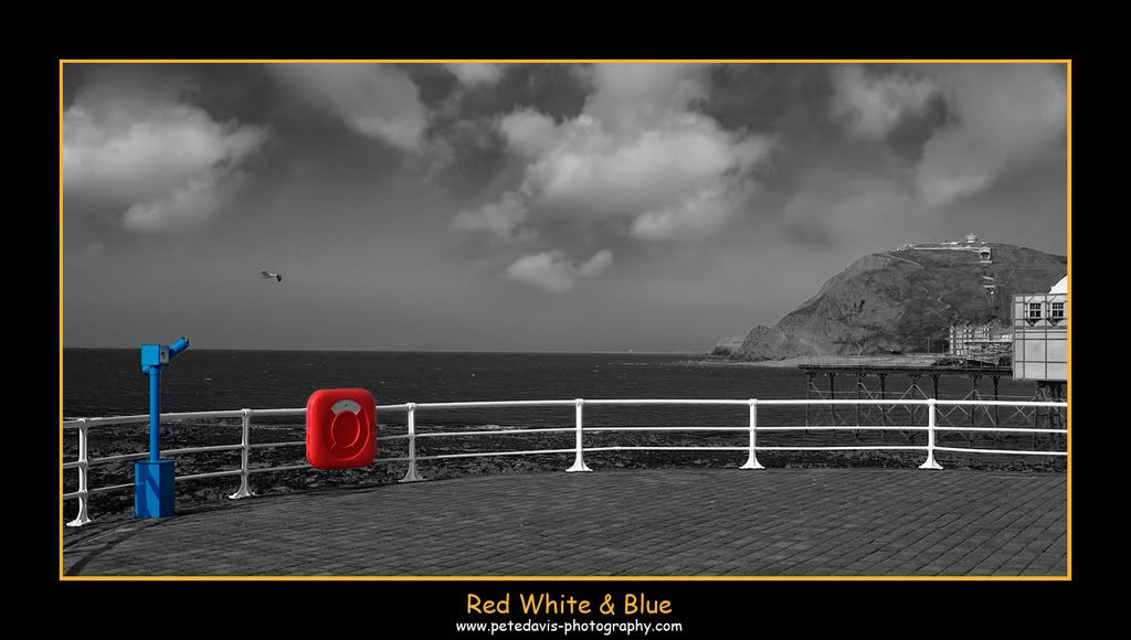
Red White & Blue

Posted 25/04/2007 - 23:36
Link
Pete,
Will you please stop getting better than I am
I like this...very much, dont know if I'd crop into a letterbox or not : but it is a VERY pleasing image just as it is
your eye for an image is definately inproving leaps and bounds.
PS; Please make cheques payable to A.F. Chapman
Quick edit......just had another look, the brightly coloured thingys in the bottom left corner grab the eye first, then the eye wanders along the railings to the cliffs and the buildings the eye then wanders in search of something else of interest by scanning the sky, finding nothing the eye settles back on the coloured bit and bobs. maybe a seagull in the sky would add a little bit more interest. As your name isn't Chris( ) I would suggest cloning one in
Posted 26/04/2007 - 04:25
Link
I like it too, can't say that the technique really does a lot for me but it's a very pleasing image.
I think you just get away with the empty sky because the coloured components make up for it but if it were monochrome, then I don't think it would work so well - still be nice though!
A couple of minor points: the horizon isn't quite level but without the picture frame, you probably wouldn't notice and the outline of the land/cliffs doesn't quite look right to me - a wee bit oversharp perhaps!
Composition wise, I think the only thing I might change very slightly is the viewpoint, I can't make my mind up as to whether I'd prefer the telescope head completely above or below the waterline
Die my dear doctor, that's the last thing I shall do!

Posted 26/04/2007 - 07:11
Link
Your best yet Pete, I like it a lot
Cheers
Brian.
LBA is good for you, a Lens a day helps you work, rest and play.
Brian.
LBA is good for you, a Lens a day helps you work, rest and play.
Posted 26/04/2007 - 10:52
Link
Thanks guys
It was a shot taken in Aberryswyth early last month. I was looking through my images and to be honest it was quite a normal everyday photo but I got to think about changing it to B&W and using the history brush to bring the colour through to make a normal image into something a bit more interesting.
I am going to redo it as it was abit of a rush job
Cheers Pete
Wedding & Portrait photographer

Posted 26/04/2007 - 16:02
Link
Originally posted by petekd on a new topic. Moved here:
Posted: Thu Apr 26, 2007 2:06 pm Post subject: Colour + B&W image (another attempt)
Hi Guys,
Here is my second attempt at Colour + B&W
Enjoy
Comments welcome

Posted: Thu Apr 26, 2007 2:06 pm Post subject: Colour + B&W image (another attempt)
Hi Guys,
Here is my second attempt at Colour + B&W
Enjoy
Comments welcome

Posted 26/04/2007 - 16:14
Link
Sorry Guys
I should have posted the new image on this thread as Matt has done for me
Appologies all round
Pete
I should have posted the new image on this thread as Matt has done for me
Appologies all round
Pete
Wedding & Portrait photographer

Posted 26/04/2007 - 20:57
Link
Try this:
Move the bird to be equidistant between the red an blue objects, and lower. Then . . .
Lose (crop) some of the sky. If you can move the clouds down a bit to retain 'atmosphere', so much the better.
Oh, and I can see now that the 'chocolate muffin' is the underside of its left wing.
Move the bird to be equidistant between the red an blue objects, and lower. Then . . .
Lose (crop) some of the sky. If you can move the clouds down a bit to retain 'atmosphere', so much the better.
Oh, and I can see now that the 'chocolate muffin' is the underside of its left wing.
Peter E Smith - flickr Photostream
Posted 27/04/2007 - 18:30
Link
Just for you Peter (Mannesty) !!
BIGGER VERSION BELOW
http://www.djblaze.talktalk.net/B&W-BirdWEB.jpg

BIGGER VERSION BELOW
http://www.djblaze.talktalk.net/B&W-BirdWEB.jpg
Wedding & Portrait photographer

Posted 27/04/2007 - 19:05
Link
Quote:
As your name isn't Chris( ) I would suggest cloning one in
But mine is. As your name isn't Chris( ) I would suggest cloning one in
Not only because I'm still grumpy that SDM doesn't stand for stop down metering, which doesn't appear to be fixed in Firmware 1.2, I'll say this:
Notwithstanding the fact that it requires no little skill with Photoshop to achieve this, not to mention patience (and credit to Pete for his obvious improvement)... my reaction to all this is...
Yuk, yuk, yuk, yukkety yuk, YUK.
Crappy snap? Who cares!!
If the background is dull and devoid of content, stick a few clouds in nicked from a better shot. No matter that if there's low cumulus like that, chances are that it'll be windier than it obviously was, which would result in the water being obviously choppier. Reality (or even realism) be damned!!
Bird in the wrong place because you don't have the patience to capture it in the right place? Who cares, just move it over a bit.
Still no interest in the scene? No probs... just chop all the colour out of the scene and paint a couple of foreground items in a nice bright colour so as to distract attention from the rest of the picture.
When we were kids we had painting by numbers kits, where if we were patient and coloured inside the lines, we got a picture that looked like we could paint. We had "join the dots" books that made it look like we'd made a picture.
But the truth was, we couldn't paint, and we couldn't draw.
It's photography, Jim, but not as we know it...
Posted 27/04/2007 - 19:18
Link
God Chris Someone has really got your back up
Sorry you dont like it
Pete
Sorry you dont like it
Pete
Wedding & Portrait photographer
Posted 27/04/2007 - 19:36
Link
Quote:
God Chris Someone has really got your back up
No, not at all Pete... really. I was grinning as I typed, honest!!God Chris Someone has really got your back up
I do think your Photoshop skills are coming on in leaps and bounds, and they're way more advanced than mine.
Quote:
Sorry you dont like it
That's all it is. I don't like it. I hate the whole approach.Sorry you dont like it
I think (a) it's dishonest (whole new thread there!!) but more to the point, (b) it's sloppy, because the convenience of the sodding about in software lets you ignore details relating to authenticity.
I made the point about the relationship between the clouds and the water - it's visually more interesting than the bland sky in the original but it isn't authentic. You might just as well stick an alien spaceship in to make it more interesting - it's content, but that's all, and it erodes the whole point of photography to my mind, which is to capture a moment in time and space that you were there to see, but which no one else was.
You may remember I posted this picture of an aerobatting Yak 50
http://i162.photobucket.com/albums/t244/chris5gd/Public/IMGP3019-1.jpg
Someone said it would look better turned round - missing completely as I said in response, that the control surfaces would then be completely wrong for the manoeuvre it was doing. Another example of how being able to quickly change things means you lose the essence of the image.
But this is just my view. You're not required to agree, and the fact that I don't like what you do doesn't mean that you should change what you do.
Keep at it, mate, fair play to you.
Add Comment
To leave a comment - Log in to Pentax User or create a new account.
740 posts
19 years
West Mids UK