IN THE CAN

Posted 11/11/2010 - 10:14
Link
Saw this earlier today Don and left it to those with LR3 as I'm a PS user.
No one commented so far.....??? BUMP BUMP.
Best regards
No one commented so far.....??? BUMP BUMP.
Best regards
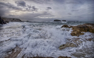
Too far from a shore.

Posted 12/11/2010 - 06:14
Link
I had one PM from I-Berg that will be handy, but yes a bit disappointing not to get more help, I seen some decent B&W on this forum.
C&C welcome.
Don.
Don.

Posted 12/11/2010 - 06:46
Link
Don,
Have a play with those additional settings, and pop it back on here for a look and comparison if you like?
Have a play with those additional settings, and pop it back on here for a look and comparison if you like?
Posted 12/11/2010 - 06:53
Link
IMO, only the back ground is "out of context" in that it does not offer enough contrast. Overall, maybe the scene lacks enough contrast?
Great subject.
Best regards
Great subject.
Best regards
Too far from a shore.

Posted 12/11/2010 - 06:54
Link
I use LR3 aswell and as you are not getting much response I hope I can provide a few helpful comments. I generally use Photoshop more, but I do most of my B+W conversions in Lightroom. However, I mainly start off with a preset, of which I have built up a bit of a collection just by googling for free presets. These include presets that mimic certain films. I then adjust after applying the preset using the sliders.
This picture looks very grey to me, it could perhaps do with some more contrast and boosting the blacks a bit. I have taken the liberty of tweaking it a bit in LR3, without using any presets. A quick run down of the adjustments, which took a couple of minutes:
Recovery 7, Fill light 10, Blacks 21, Contrast +17, Clarity +26

I'm not sure if there's much improvement, I hope o, and I hope this has been at least a little helpful.
Rgds, Jon
Posted 12/11/2010 - 07:11
Link
Thanks Jon, every bit helps and I can only improve.
C&C welcome.
Don.
Don.


Posted 12/11/2010 - 07:58
Link
Don
I agree with Jon - start with a preset; either one that is bundled or downloaded (google will come up with loads). The improvement in contrast helps. For this subject, you may also want to look at a toned B&W - the "Antique Grayscale" I always find quite nice, or just play with the split toning sliders and yellow for a sepia type effect. And lastly a touch of vignette to darken the corners and focus on the girl?
Cheers
Tony
Add Comment
To leave a comment - Log in to Pentax User or create a new account.
2930 posts
18 years
Atherton tablelands,
NQ
Had a play, decided I need more practice with B&W
[IMG]http://i150.photobucket.com/albums/s95/muffin51/Melissa/Melissaathome28of28-Edit.jpg[/IMG]
what programmes do people use?I did this in lightroom 3, all tips welcome.
Don.