Help me improve

Posted 19/09/2007 - 12:47
Link
As for processing of the image as shown I would start with the following,
1. Straighten the image. The walls of the buildings should generally be straight up and down. Maybe due to pincushion effects from the wide angle lens? (The center looks straight, but walls tilt as you get towards the edge.)
2. I would probably crop in closer. The trees and space on the left don't add much for me. If that is of interest to you, maybe think about turning it into a panorama and crop off some of the large green area at the bottom of the image and extraneous sky.
3. The color looks pretty good to me, but you might want to play with curves or levels to bring up the contrast a bit more.
Posted 19/09/2007 - 13:28
Link
Quote:
As for processing of the image as shown I would start with the following,
1. Straighten the image. The walls of the buildings should generally be straight up and down. Maybe due to pincushion effects from the wide angle lens? (The center looks straight, but walls tilt as you get towards the edge.)
I didn't notice that, thanks.As for processing of the image as shown I would start with the following,
1. Straighten the image. The walls of the buildings should generally be straight up and down. Maybe due to pincushion effects from the wide angle lens? (The center looks straight, but walls tilt as you get towards the edge.)
Quote:
3. The color looks pretty good to me, but you might want to play with curves or levels to bring up the contrast a bit more.
the colours to me look a bit like an old oil painting, which I quite like. Contrast is generally a problem in England - overcast skies result in pretty dull colours. Even when the sun comes out colours can be a bit washed out, this is why I used the polariser, to try and make the sky a deeper blue.
3. The color looks pretty good to me, but you might want to play with curves or levels to bring up the contrast a bit more.
Pentax K100D
DA 18-55 kit lens
A50/1.7 A28/2.8 M50/1.4 M135/3.5 A70-210/4
DA 18-55 kit lens
A50/1.7 A28/2.8 M50/1.4 M135/3.5 A70-210/4
Add Comment
To leave a comment - Log in to Pentax User or create a new account.
43 posts
18 years
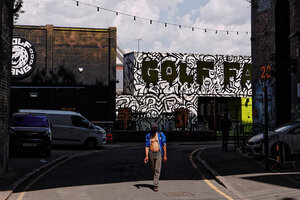
Lens set to 24mm, ISO 200 f8.0 1/180. Shot as RAW, but no processing.
The sun is just to the left of the picture and was covered by the clouds for the rest of the day. I used a circular polariser. I noticed when I was viewing this picture that I had left Shake Reduction on.
To the right of the picture are more modern buildings. It was the clouds and the sandstone castle that caught my eye.
So, how should I improve it? What about the composition? I have done no processing, and the camera chose the exposure, what processing do you think should be carried out?
DA 18-55 kit lens
A50/1.7 A28/2.8 M50/1.4 M135/3.5 A70-210/4