Critique Thread No. 1

Posted 08/06/2010 - 22:07
Link
Personally I prefer the original. This is because the colour looks less artificial and the extra space around the window gives the subject room to "breathe" in the composition. The crop is too tight and claustrophobic for my taste.
Best regards, John

Posted 08/06/2010 - 22:16
Link
OK, I like the crop. There is too much wall in the raw. You could have left the original colour. I don't like the single tone as it reduced the distinction of the layers, flattening it. Its pretty monotone anyway, pink/sepia just seems affected.
I guess its about the saplings overcoming the walls and reclaiming the abandoned environment.
Perhaps a tad to the left would show all the trunks separately but you look like your trying to avoid a post on your left and a tree on your right. Maybe a wider lens closer?
I would have just bumped the contrast slightly.
Lurking is shirking.!

Posted 08/06/2010 - 22:47
Link
I'm with John the sepia colour is too thick I believe but besides that I like the crop that you used and I love the steps of distance in your photo.
I also believe that monochrome would work very well with this photo, this a quick "run" from me. First time I used the offset filter
It's a 50% photo.
[IMG]http://i282.photobucket.com/albums/kk244/Anvh/US-Easter-2010-186.jpg[/IMG]
didn't decide to crop it because I believe the wall in the foreground provides more emphasis in depth.
I might have another go tomorrow, my eyes are tired
Stefan

K10D, K5
DA* 16-50, DA* 50-135, D-FA 100 Macro, DA 40 Ltd, DA 18-55
AF-540FGZ

K10D, K5
DA* 16-50, DA* 50-135, D-FA 100 Macro, DA 40 Ltd, DA 18-55
AF-540FGZ

Posted 08/06/2010 - 23:35
Link
Hi!
I find the twigs that are close to the front window, somewhat distracting, though they might be right thematically. Also the part of a trunk that shows on the right should be cloned out. Otherwise the image is good in my opinion. In BW it looks better.
Regards,
Tobio
I find the twigs that are close to the front window, somewhat distracting, though they might be right thematically. Also the part of a trunk that shows on the right should be cloned out. Otherwise the image is good in my opinion. In BW it looks better.
Regards,
Tobio
Best regards,
Tobio
K20d with Tamron AF 90mm f/2.8 Di SP macro , smc da 18-55 mm, smc da 50-200 mm and smc da 55-300 mm + Metz 58 af-1. Editing with Pentax Photolab, Gimp and Paint.net.
Tobio
K20d with Tamron AF 90mm f/2.8 Di SP macro , smc da 18-55 mm, smc da 50-200 mm and smc da 55-300 mm + Metz 58 af-1. Editing with Pentax Photolab, Gimp and Paint.net.

Posted 09/06/2010 - 07:21
Link
I liked the colour of the (birch?) in the window and although I
think the rest of the picture looks quite
mono anyway I wanted to see if I could bring out both the colour and monotone elements of the picture.
I had a go at the RAW image, masked off the orangish tree trunk
and the view through the window then
converted the rest of the picture to black and white.
Then I used the sponge tool to desaturate the view through the
back window a bit, saturate the tree a bit more, and used a bit
of dodging of highlights on the walls to increase the contrast a bit.


Posted 09/06/2010 - 11:09
Link
I can see that some would see the 'split toning' in the first as too strong.
It seems close to what Nik software call their 'Ambrotype' preset.
But this goes to show two things - firstly, just how subjective this is (beauty in the eye etc).
Once any technical matters have been dealt with as 'threshold issues'
(as they certainly had by Kris), the discussion is one primarily, if not solely, of aesthetics.
Secondly, that each of these images, with their various processing applied, could do equally well -
depending on the context in which it was displayed. I say that because I try to put these
in contexts other than being displayed on a monitor. So, which frame and which wall?
All of them would look just fine, in the right context.
I'm a bit on the fence as to the crops - either works for me.
So does the processing, and also the mono original (although I agree that the contrast, & clarity,
might benefit from a bump in LR3 Kris).
The other observation I would have made has already been raised by Doug,
and that was pertaining to the choice of lens. I wondered if this choice,
more so than the crop, was what was giving the image a slightly 'compressed' look?
Perhaps that's what Doug was intending too.
I think Kris is right to be pleased with the image.
Edits for manual carriage returns.
Posted 09/06/2010 - 11:34
Link
I forgot to mention in my previous post exactly why I had a go at processing the RAW file:
I really like the original version, I'm not so keen on the crop, and I also thought the sepia/doutone effect a bit strong.
However, I thought the original version could do with a bit more "bite", but perhaps I have put a bit too much colour into the tree?
I really like the original version, I'm not so keen on the crop, and I also thought the sepia/doutone effect a bit strong.
However, I thought the original version could do with a bit more "bite", but perhaps I have put a bit too much colour into the tree?
Posted 09/06/2010 - 14:22
Link
i-Berg wrote:
The other observation I would have made has already been raised by Doug,
and that was pertaining to the choice of lens. I wondered if this choice,
more so than the crop, was what was giving the image a slightly 'compressed' look?
Perhaps that's what Doug was intending too.
I wonder if that would have worked because all the perspective would change, I think you might get in trouble that the window in the window would be less obvious.
The other observation I would have made has already been raised by Doug,
and that was pertaining to the choice of lens. I wondered if this choice,
more so than the crop, was what was giving the image a slightly 'compressed' look?
Perhaps that's what Doug was intending too.
Stefan
K10D, K5
DA* 16-50, DA* 50-135, D-FA 100 Macro, DA 40 Ltd, DA 18-55
AF-540FGZ
K10D, K5
DA* 16-50, DA* 50-135, D-FA 100 Macro, DA 40 Ltd, DA 18-55
AF-540FGZ

Posted 09/06/2010 - 15:15
Link
I've submitted a few photos for consideration there recently. Reading through the guidelines they seem to want in-camera effects only. Maybe that was a factor. I prefer the original colors - they seem to lend much greater depth to the view through the window. In fact I don't much like the colour of the first.

Posted 09/06/2010 - 15:25
Link
Kris, I think your crop definitely improved the shot, the original shot had too much empty space for me (especially the left hand side). In fact, a crop keeping the right hand side of the original shot (therefore making the window off-centre) might have been interesting.
In terms of colour, I actually prefer the original if I'm honest. The processed picture looks a little flat as a result of the work done on it.
All in all I like the shot, as I too like pictures showing decay, wear and tear, etc. though I think different lighting on the day (or even shot at a different time of day) to provide some shadows might have added a little more interest.
If you can't say something nice about Pentax, you won't say anything at all.
Apparently.
Apparently.

Posted 09/06/2010 - 15:32
Link
This is a super idea, Kris. Couldn't get the RAW file for some reason so made do with your JPEG.
I too love old, ruined buildings which have been partially reclaimed by nature...
Crop, levels, curves, duo-tone, sharpen. Doesn't it feel different working on someone else's picture?
[IMG]http://i927.photobucket.com/albums/ad116/ADC3440/Kriss.jpg[/IMG]
I too love old, ruined buildings which have been partially reclaimed by nature...
Crop, levels, curves, duo-tone, sharpen. Doesn't it feel different working on someone else's picture?
[IMG]http://i927.photobucket.com/albums/ad116/ADC3440/Kriss.jpg[/IMG]
Best wishes,
Andrew
"These places mean something and it's the job of a photographer to figure-out what the hell it is."
Robert Adams
"The camera doesn't make a bit of difference. All of them can record what you are seeing. But, you have to SEE."
Ernst Hass
My website: http://www.ephotozine.com/user/bwlchmawr-199050
http://s927.photobucket.com/home/ADC3440/index
https://www.flickr.com/photos/78898196@N05
Posted 09/06/2010 - 16:11
Link
bwichmawr wrote:
This is a super idea, Kris. Couldn't get the RAW file for some reason so made do with your JPEG.
I too love old, ruined buildings which have been partially reclaimed by nature...
Crop, levels, curves, duo-tone, sharpen. Doesn't it feel different working on someone else's picture?
[IMG]http://i927.photobucket.com/albums/ad116/ADC3440/Kriss.jpg[/IMG]
I like that very much Andrew.
This is a super idea, Kris. Couldn't get the RAW file for some reason so made do with your JPEG.
I too love old, ruined buildings which have been partially reclaimed by nature...
Crop, levels, curves, duo-tone, sharpen. Doesn't it feel different working on someone else's picture?
[IMG]http://i927.photobucket.com/albums/ad116/ADC3440/Kriss.jpg[/IMG]
If you can't say something nice about Pentax, you won't say anything at all.
Apparently.
Apparently.

Posted 09/06/2010 - 17:20
Link
I, personally, am finding this thread really interesting but will refrain from commenting for a little while yet. I hope everyone agrees it is a useful/interesting thing to do and someone will volunteer another image sometime next week.
Perhaps we could have the general guidelines as a sticky?
Best wishes, Kris.
Perhaps we could have the general guidelines as a sticky?
Best wishes, Kris.
Kris Lockyear
It is an illusion that photos are made with the camera they are made with the eye, heart and head. Henri Cartier-Bresson
Lots of film bodies, a couple of digital ones, too many lenses (mainly older glass) and a Horseman LE 5x4.
It is an illusion that photos are made with the camera they are made with the eye, heart and head. Henri Cartier-Bresson
Lots of film bodies, a couple of digital ones, too many lenses (mainly older glass) and a Horseman LE 5x4.
Add Comment
To leave a comment - Log in to Pentax User or create a new account.
7658 posts
17 years
Hertfordshire,
mostly.
In the case of my example image, I am going to post the final image, and the original image. I will also try and make the RAW file available via Microsoft's "skydrive" if anyone wants to have a go at processing the file themselves and posting the results.
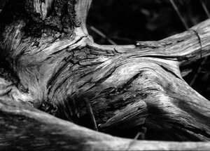
Image Number 1: Overlook Mountain Lodge.
I have an interest in, and liking for images of, decaying buildings. This is because as an archaeologist they represent the stage between currently used and occupied buildings and the remains I excavate. Also, I find the power of nature reclaiming the works of man evocative, reminding me that everything is impermanent, transitory, in decay.
With this particular image, the trees growing through the window seemed to work with my general aim, and the symmetry of seeing one window through the other appealed compositionally. Generally, I like monochrome, and it seemed to suit the mood of the image, but in this case I felt I needed a little more and so went for a split toned image. I tried to set the aperture so that the main elements in the foreground were in focus, and the depth would be emphasised by the out-of-focus background. A SMC-M 100mm f/2.8 lens was used.
I, personally, really liked the final image. My only query to myself is whether the split toning worked. Unfortunately, the PPG didn't like it and rejected it confirming my opinion that the PPG almost exclusively goes for "nice" images.
I'd be interested in your thoughts.
The final image:
The original image:
Hopefully, you can download the RAW file from here. If using this link doesn't work I am open to suggestions as to how to make the RAW file available.
Best wishes, Kris.
It is an illusion that photos are made with the camera they are made with the eye, heart and head. Henri Cartier-Bresson
Lots of film bodies, a couple of digital ones, too many lenses (mainly older glass) and a Horseman LE 5x4.