Critique Please (1)

Posted 03/10/2013 - 11:30
Link
The flowers and vase are OK, but for me it needs a more attractive/interesting setting. I do like the stately formality of the composition.
Best regards, John

Posted 03/10/2013 - 11:31
Link
I'm gunna say nay, the lighting just doesn't work for me, I like the reflection though
One day you'll find, 10yrs have got behind you.

Posted 03/10/2013 - 11:36
Link
Like John, I don't think the background works. Also my eye went for the highlight on the vase, which is not balanced by anything to bring out the flowers.
Barrie - Too Old To Die Young
https://pentaxphotogallery.com/artists/barrieforbes
https://www.flickr.com/photos/189482630@N03/
https://pentaxphotogallery.com/artists/barrieforbes
https://www.flickr.com/photos/189482630@N03/

Posted 03/10/2013 - 11:40
Link
Rats
Learn how to live and you'll know how to die; learn how to die, and you'll know how to live.
Check out ones photographs on Flickr!
https://www.flickr.com/photos/awprentice/
Check out ones photographs on Flickr!
https://www.flickr.com/photos/awprentice/
Posted 03/10/2013 - 11:42
Link
QuestionableCarrot wrote:
Rats
I hope that's not a comment on our critique
Rats
Barrie - Too Old To Die Young
https://pentaxphotogallery.com/artists/barrieforbes
https://www.flickr.com/photos/189482630@N03/
https://pentaxphotogallery.com/artists/barrieforbes
https://www.flickr.com/photos/189482630@N03/
Posted 03/10/2013 - 11:46
Link
No of course not Barrie. Thought I had something going there. I am well used to critique by now!
Learn how to live and you'll know how to die; learn how to die, and you'll know how to live.
Check out ones photographs on Flickr!
https://www.flickr.com/photos/awprentice/
Check out ones photographs on Flickr!
https://www.flickr.com/photos/awprentice/

Posted 03/10/2013 - 11:56
Link
QuestionableCarrot wrote:
Rats
Its not easy this photography lark. Rats
I agree with the others. Each time looked at the photo my eyes would not see the flowers. Straight to the vase, the lighting on the flowers doesn't seem quite right. Although i nice idea side lighting them with natural light from the window. I think the biggest thing i'm not keen on is the table. Cropping off the table, by accident while scrolling, it looked much better. Just the vase, flowers and grey background. It also gets rid of that shadow caused by the vase, but you lose the nice reflection.
Posted 03/10/2013 - 12:08
Link
Exactly Russ
Thats EXACTLY been the conundrum in this shot. I cant strike the balance.
What about this mono version peeps?

Thats EXACTLY been the conundrum in this shot. I cant strike the balance.
What about this mono version peeps?

Learn how to live and you'll know how to die; learn how to die, and you'll know how to live.
Check out ones photographs on Flickr!
https://www.flickr.com/photos/awprentice/
Check out ones photographs on Flickr!
https://www.flickr.com/photos/awprentice/

Posted 03/10/2013 - 12:10
Link
The basic idea and composition I like. I really like the flowers and the shape of the vase, the colour of the background, the reflection and the space you have afforded the subject.
I think the flowers need a bit of fill light. The processing feels a bit, I don't know, 'glowy' which I think could be reigned in a little.
The vase itself I don't think looks classy enough. The table I don't like. The background and the stately home look seems to me rather at odds with the shiny, modern looking table. The shadow would only work for me with the window in the scene too. The rear right corner of the table looks a bit odd.
So mixed feelings.
I think the flowers need a bit of fill light. The processing feels a bit, I don't know, 'glowy' which I think could be reigned in a little.
The vase itself I don't think looks classy enough. The table I don't like. The background and the stately home look seems to me rather at odds with the shiny, modern looking table. The shadow would only work for me with the window in the scene too. The rear right corner of the table looks a bit odd.
So mixed feelings.
Posted 03/10/2013 - 12:15
Link
Cheers for that.
Ok back to the original shot. How about some more aggressive contrast and boost to the overall colour and texture?
Pleae let me know what you think is best overall because I have to go with tone of them

Ok back to the original shot. How about some more aggressive contrast and boost to the overall colour and texture?
Pleae let me know what you think is best overall because I have to go with tone of them

Learn how to live and you'll know how to die; learn how to die, and you'll know how to live.
Check out ones photographs on Flickr!
https://www.flickr.com/photos/awprentice/
Check out ones photographs on Flickr!
https://www.flickr.com/photos/awprentice/
Posted 03/10/2013 - 12:21
Link
I would go the opposite and desaturate somewhat, especially the table and pattern on the vase.

Posted 03/10/2013 - 12:24
Link
my take would be to offset the vase to the left and come in a bit closer so the reflection is in the bottom third of the shot.
Pentax K3, DA 18-55 WR, Sigma 50-500 EX DG HSM, Pentax M-50, a bucket load of SD cards, some lights and a lightbox
Posted 03/10/2013 - 12:27
Link
ok is this any better guys?
I kinda like the way both shadows sit in the bottom left now

I kinda like the way both shadows sit in the bottom left now

Learn how to live and you'll know how to die; learn how to die, and you'll know how to live.
Check out ones photographs on Flickr!
https://www.flickr.com/photos/awprentice/
Check out ones photographs on Flickr!
https://www.flickr.com/photos/awprentice/
Posted 03/10/2013 - 12:48
Link
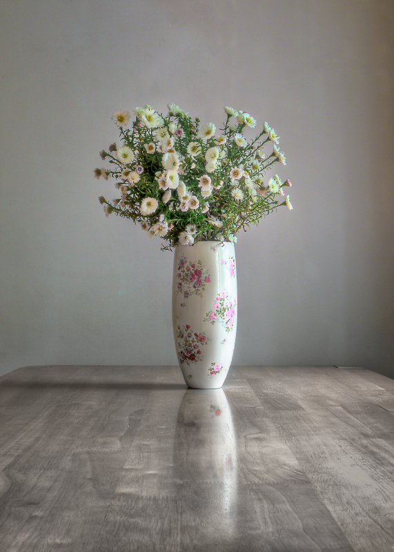
My take would be something like this:

Add Comment
To leave a comment - Log in to Pentax User or create a new account.




1520 posts
15 years
Check out ones photographs on Flickr!
https://www.flickr.com/photos/awprentice/