Amble after the rain

Posted 29/08/2010 - 12:46
Link
Sorry Barrie my mistake, the penalty of typing whilst listening to my other half talking about something totally different. I meant the lead in. I so often want to catch the vastness of what I see, quite often I am shooting from harbour walls leaving me high above any subject, maybe I should get a kayak?

Posted 29/08/2010 - 12:59
Link
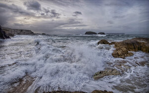
I particluarly like nos. 1 and 4. Good composition, strong colours and excellent highlight and shadow details. The latter not easy to achieve under the circumstances.
Best wishes,
Andrew
"These places mean something and it's the job of a photographer to figure-out what the hell it is."
Robert Adams
"The camera doesn't make a bit of difference. All of them can record what you are seeing. But, you have to SEE."
Ernst Hass
My website: http://www.ephotozine.com/user/bwlchmawr-199050
http://s927.photobucket.com/home/ADC3440/index
https://www.flickr.com/photos/78898196@N05

Posted 29/08/2010 - 13:17
Link
No's 2 & 4 for me. Number 2 just works so well. It's a brochure shot.
Well seen, captured and presented.
Regards
Well seen, captured and presented.
Regards
Too far from a shore.

Posted 29/08/2010 - 13:34
Link
Just love 'Cliff House' (the first). I wouldn't change a thing.
Regards,
Stephen
Regards,
Stephen
I gladly welcome C & C's. Being foggy minded they really help me learn.

Posted 29/08/2010 - 14:16
Link
I really like them all
For the last two I like number II because the... "pier" is in the centre enforcing the sense of depth the later one has that less.
For the last two I like number II because the... "pier" is in the centre enforcing the sense of depth the later one has that less.
Stefan

K10D, K5
DA* 16-50, DA* 50-135, D-FA 100 Macro, DA 40 Ltd, DA 18-55
AF-540FGZ

K10D, K5
DA* 16-50, DA* 50-135, D-FA 100 Macro, DA 40 Ltd, DA 18-55
AF-540FGZ
Posted 29/08/2010 - 18:52
Link
Thanks for all the comments, I really appreciate the time spent.
Graham
Graham
Posted 29/08/2010 - 19:05
Link
This is a crop as suggested by Tim (thoughton) any thoughts?


Posted 29/08/2010 - 23:55
Link
Very nice - especially the water reflections on #1. The only thing I don't like about them is that they're making me consider getting a 16-45 despite the fact that I need a faster lens!
Posted 30/08/2010 - 08:52
Link
MrCynical wrote:
Very nice - especially the water reflections on #1. The only thing I don't like about them is that they're making me consider getting a 16-45 despite the fact that I need a faster lens!
I noticed you have a Sigma 10-20, where do you feel that it fails causing you to want a 16-45, I tend to use mine between 16 & 18mm? I only ask because the 10-20 is probably my next purchase, although I had promised myself that I would save up for better quality or faster lenses from now on, I still want a DA* 300
Very nice - especially the water reflections on #1. The only thing I don't like about them is that they're making me consider getting a 16-45 despite the fact that I need a faster lens!
Add Comment
To leave a comment - Log in to Pentax User or create a new account.
6913 posts
17 years
Co. Durham UK
https://pentaxphotogallery.com/artists/barrieforbes
https://www.flickr.com/photos/189482630@N03/