A Misty Morning in Beaumaris

Posted 06/06/2010 - 16:07
Link
I really enjoyed the first and last photos. They say so much about the British seaside.

Posted 06/06/2010 - 16:32
Link
Couldn`t agree more.......................
Excellent vision as always
Tony
Excellent vision as always
Tony
K20D,*istD ( now a dedicated M42 digital ),K100D,MZ5N,P50,ME Super,Spotmatic 1000,Spotmatic,ESII,ES,H2.18-55 II,18-55,75-300 FAJ,35-80 FA,80-200 F,28-105 FA,Sigma 24-70 AF Aspherical,Sigma 28-300 Hyperzoom , Praotor II 500 M42,Centon 500mm mirror,and a few Pentax M42 Taks,super-Taks,smc Taks,A and M lenses.Benbo trekker,7dayshop monopod and a Lowepro rucksack.
I am now on Flickr which is nice !
I am now on Flickr which is nice !

Posted 06/06/2010 - 16:44
Link
I agree, the first two sum up nicely what the British summer seaside is.
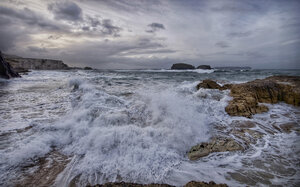
I think "Becalmed" could lose most of the sky IMHO and work in "Landscape" orientation. However, this could be bias, as I always prefer landscape..for some reason.
I think "Becalmed" could lose most of the sky IMHO and work in "Landscape" orientation. However, this could be bias, as I always prefer landscape..for some reason.
Getting there! Thanks to you guys
Pentax K3ii, Pentax K10d, Kit lens ( 18-55mm ), 50mm f1.7 lens, Tamron 70-300mm lens, Prinzflex 70-162 manual lens, Various old flashes.
Pentax K3ii, Pentax K10d, Kit lens ( 18-55mm ), 50mm f1.7 lens, Tamron 70-300mm lens, Prinzflex 70-162 manual lens, Various old flashes.

Posted 06/06/2010 - 16:51
Link
I agree with comments on first and last - proper brit seaside... I really like becalmed, and in the portrait format as you have it - I suspect it just comes down to individual tastes. I can see how it would also work as Father Ted suggests.
I'd like to go and see some Puffins now as well
Regards
I'd like to go and see some Puffins now as well
Regards

Posted 06/06/2010 - 17:38
Link
Thanks everyone, for your comments.
I wanted to shoot "Becalmed" in portrait format, perversely, because of the very emptiness of the sky. I always try to fill every corner of a photo and usually crop quite tightly but the vast white void of cloud and mist seemed different. Less is more? Maybe!
I wanted to shoot "Becalmed" in portrait format, perversely, because of the very emptiness of the sky. I always try to fill every corner of a photo and usually crop quite tightly but the vast white void of cloud and mist seemed different. Less is more? Maybe!
Best wishes,
Andrew
"These places mean something and it's the job of a photographer to figure-out what the hell it is."
Robert Adams
"The camera doesn't make a bit of difference. All of them can record what you are seeing. But, you have to SEE."
Ernst Hass
My website: http://www.ephotozine.com/user/bwlchmawr-199050
http://s927.photobucket.com/home/ADC3440/index
https://www.flickr.com/photos/78898196@N05

Posted 06/06/2010 - 21:04
Link
Excellent set once again Andrew agree with comments typicall Brit seaside
Emma
"Photography is a way of feeling, of touching, of loving. What you have caught on film is captured forever... it remembers little things, long after you have forgotten everything." Aaron Siskind
Bodies K20D, LTL 3, K1000d
Lenses Pentax 50mm, Pentax 135mm, Tamron 70-300 macro
"Photography is a way of feeling, of touching, of loving. What you have caught on film is captured forever... it remembers little things, long after you have forgotten everything." Aaron Siskind
Bodies K20D, LTL 3, K1000d
Lenses Pentax 50mm, Pentax 135mm, Tamron 70-300 macro

Posted 06/06/2010 - 21:21
Link
OK time to be unpopular.
Can anyone tell me how the composition works in the first shot?
The last one has better composition but looks over sharpened to me and really doesn't seem all that interesting.
I don't get it - there seems to be a lot of fuzzy thinking and resulting praise or perhaps it's me. I can't see how those two shots are excellent but I expect it's my lack of vision and sophistication so can someone explain to me why these shots are so good is simple terms.
I don't mean to rain on anyone's parade and I know I am out of step with the majority here but I need an analysis of why those shots work. I am here to learn and improve.
TIA
Mike
---------------------------------------------------
You can see some of my shots at my Flickr account.
You can see some of my shots at my Flickr account.
Posted 06/06/2010 - 22:01
Link
Interesting thoughts, Mike.
I can't defend the composition in either shot you highlight. Not sure anyone is praising that aspect. They're tightly cropped, both in camera and afterwards, to fill the frame with a jumble of colour, shapes and visual activity. Neither shot would be the same without the two characters in them, for different reasons, which is partly why I took them. I'm not a great admirer of Martin Parr's work, I think he's way over-rated, but these two shots are similar to his seaside stuff without being so intrusive or forensic.
You may be right about the oversharpening although all received my usual treatment. I certainly wouldn't want it to be blurred, that would be missing the point!
Hope you don't think Bench, Footpath or Becalmed are poorly composed because composition is an important part of what I was trying to do with them.
I love people to like my photos, but I never mind criticism or having to explain why I took them or what I was trying to achieve even if I fail to convinc people. I a way, having to explain means I've failed, kind of why so much of modern art doesn't work for me: I just don't get it.
I think this is an OK set, not great, but the shots were intended to work together as a set: time and place and light.
Thanks for you interest.
Best wishes,
Andrew
"These places mean something and it's the job of a photographer to figure-out what the hell it is."
Robert Adams
"The camera doesn't make a bit of difference. All of them can record what you are seeing. But, you have to SEE."
Ernst Hass
My website: http://www.ephotozine.com/user/bwlchmawr-199050
http://s927.photobucket.com/home/ADC3440/index
https://www.flickr.com/photos/78898196@N05
Andrew
"These places mean something and it's the job of a photographer to figure-out what the hell it is."
Robert Adams
"The camera doesn't make a bit of difference. All of them can record what you are seeing. But, you have to SEE."
Ernst Hass
My website: http://www.ephotozine.com/user/bwlchmawr-199050
http://s927.photobucket.com/home/ADC3440/index
https://www.flickr.com/photos/78898196@N05
Posted 06/06/2010 - 22:12
Link
Andrew I was really hoping some of those who praised the shots would offer an analysis of why they struck such a strong chord for them. The photographer is often too close to be able to explain why they work for others but as you have done can offer an explanation of their motivation.
The shots I didn't mention were clearly thoughtfully composed. Surely every shot is composed though and to say you can't defend the composition seems an odd statement. I'm not having a go, just exploring themes but every photograph is the result of choices and the most fundamental (after deciding to take the shot at all) is surely the choice of composition.
Incidentally you seem to suggest you always apply the same settings for each shot. Looking at fused and ticket booth; fused doesn't look unduly sharp while the ticket booth seems to be a bit over sharpened and brittle. Personally I always adjust the sharpening post resizing individually for each shot as I find what works for one can be way over the top for another.
Mike
---------------------------------------------------
You can see some of my shots at my Flickr account.
You can see some of my shots at my Flickr account.
Posted 06/06/2010 - 22:15
Link
I wouldn't have those shots framed. But there are stories there made by the characters - and my eye is immediately drawn to them. I'm sat here in the middle of France and there's a well observed little slice of life back home. The other shots add context too. That's why I like the set. Becalmed is a little different - I like the portait aspect but it's difficult to appreciate the shot due to the scrolling required.
I make no comment on technical merit - I'm not qualified to do so in any event - but they just work, somehow and for me there's nothing wrong with a bit of intangible
I make no comment on technical merit - I'm not qualified to do so in any event - but they just work, somehow and for me there's nothing wrong with a bit of intangible
Posted 06/06/2010 - 22:20
Link
I guess what you say has some strength but I can't see that the first and last really do anything more than record - blimey I'm walking on eggshells here not wanting to give offence and it's not my strength! Blunt is my usual style!
They need something a bit more I feel to use the people in them or to use the main subject matter.
Mike
They need something a bit more I feel to use the people in them or to use the main subject matter.
Mike
---------------------------------------------------
You can see some of my shots at my Flickr account.
You can see some of my shots at my Flickr account.

Posted 07/06/2010 - 00:35
Link
The first one doesn't work for me I'm afraid. The character isn't part enough of the picture and I am unsure what I am looking at. The last one does work for me because of the lady selling tickets. I might have been tempted to get straight on though.
"Becalmed" I love and would frame and put on the wall. The high key approach, the empty skies etc. all make it very atmospheric. I have noticed that most landscapes these days tend to be highly saturated and colourful with stunningly dramatic skies all of which look somewhat unreal. My only suggestion would be to try a weak graduated filter on the image just to bring out the slightest touch more texture in the sky. It is one of those images that would have to be printed on very high quality paper with a good printer so that the subtle tonality would come through.
The "Red Bench Peeling" is a classic Andrew shot which I rather like. "Footpath" doesn't quite work for me although I would play with some different crops.
All in all, a nice set but "Becalmed" stands out.
BTW, to those who commented about scrolling... can't you just click on the image and see it in full in another window? That is what happens when I use Firefox.
Best wishes, Kris.
Kris Lockyear
It is an illusion that photos are made with the camera they are made with the eye, heart and head. Henri Cartier-Bresson
Lots of film bodies, a couple of digital ones, too many lenses (mainly older glass) and a Horseman LE 5x4.
It is an illusion that photos are made with the camera they are made with the eye, heart and head. Henri Cartier-Bresson
Lots of film bodies, a couple of digital ones, too many lenses (mainly older glass) and a Horseman LE 5x4.

Posted 07/06/2010 - 06:07
Link
I have no desire to stick my head above the parapet, neither do I want to upset anyone, but I do have to say that I agree with Mike on this.
While I think a lot of Andrews pictures (eg the ones from Mallorca) are very good, I don't find anything in this set, with the possible exception of Becalmed, that warrants the praise they have received. Apart from the two mentioned by Mike, in my opinion The Shallow End looks like a casual snapshot with no regard to composition, and I don't see anything interesting in Footpath. This is not a criticism of the photographer but a criticism of the pictures that have been put here for us to comment on.
I thought the whole purpose of the Your Photos Forum on this site was to receive constructive criticism? I don't believe it is fair to a photographer to have their work praised when what it needs is constructive comments. If I take a good picture, it's nice to have that recognised. Similarly, but more importantly to the continued development of my photography, I want to be told where I am going wrong and how I could improve. I certainly don't want to be told that an average photograph is good.
I notice that a number of members who regularly comment on pictures have not commented on this set. Are some photographers on here beyond criticism? If so, could someone explain why?
Praise where praise due, but most of us are here to improve our skills, not to be made to think we have nothing further to learn.
I hope, Andrew, you will take my comments in the spirit in which they were meant. I have admired a lot of your photographs, and my comments have reflected this. I hope you will not take offence, none is intended.
Best Regards,
Jon

Posted 07/06/2010 - 07:32
Link
Andrew and all contributors,
I'd like to contribute to this, in a constructive way, by first saying I agree in principle with Mike's message about the use of 'critique' to help us all improve our skills.
None of this ought to be see as detracting from Andrew's images, neither from these nor from those in any of his many other valuable series. This just seems to be the most recent place where this issue has again become extant.
As a relatively new chum here, I suggest that the more experienced people here who are adept at articulating their judging, all collaborate to produce a C&C 'style template'.
I'm sensing that some structure would provide a means, a vehicle if you like, to facilitate the C&C. And maybe make Mike happy...
People wishing to comment on any images in this forum would then be welcome to:
- use that 'style template' on its own (ie, fill in the blanks),
- use the template as the basis for their own synthesis
- use the template in conjunction with their own C&C and commentary
- ignore the template and provide C&C in their own way.
As you can see above, no-one is compelled to use it of course, so it is not as if a template would become stifling or restrictive.
When completed, the proposed 'style template' could be made into a sticky post in this forum.
So - what say ye?
Add Comment
To leave a comment - Log in to Pentax User or create a new account.
3447 posts
16 years
Somerset
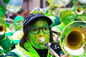
By the Seaside
[IMG]http://i927.photobucket.com/albums/ad116/ADC3440/Pictures170.jpg[/IMG]
Becalmed
[IMG]http://i927.photobucket.com/albums/ad116/ADC3440/Pictures175.jpg[/IMG]
Red Bench Peeling
[IMG]http://i927.photobucket.com/albums/ad116/ADC3440/Pictures177.jpg[/IMG]
Footpath
[IMG]http://i927.photobucket.com/albums/ad116/ADC3440/Pictures186a.jpg[/IMG]
The Shallow End
[IMG]http://i927.photobucket.com/albums/ad116/ADC3440/Pictures183-1.jpg[/IMG]
Fused
[IMG]http://i927.photobucket.com/albums/ad116/ADC3440/Pictures185.jpg[/IMG]
Ticket Booth
[IMG]http://i927.photobucket.com/albums/ad116/ADC3440/Pictures173-1.jpg[/IMG]
Hope you enjoy them.
Andrew
"These places mean something and it's the job of a photographer to figure-out what the hell it is."
Robert Adams
"The camera doesn't make a bit of difference. All of them can record what you are seeing. But, you have to SEE."
Ernst Hass
My website: http://www.ephotozine.com/user/bwlchmawr-199050
http://s927.photobucket.com/home/ADC3440/index
https://www.flickr.com/photos/78898196@N05