Weekly Competition #341 - Blue Competition
| Title | Weekly Competition #341 - Blue |
|---|---|
| Judge | johnriley | Closing Date | 26/01/2014 | Opting Out | If you'd like to enter but not keen on creating and judging the following competition you have the option to opt out. If you're selected as the winning photo simply create a report saying that you'd like Admin to take over and we'll do the rest. |
| Description | |
Digital cameras seem to reproduce blue beautifully, so this competition is all about a celebration of the colour blue. However, let's not be too proscriptive, so for those who like lateral thinking the feeling blue can also be included. Just take the word Blue and make your image sing out to us....blue. Basic rules apply, so Pentax cameras only, Ricoh GR and Samsung DSLRs made by Pentax included. Images can be any age. No discussions here until after the judging has taken place. I'll create a discussion thread for you in the forum. |
|
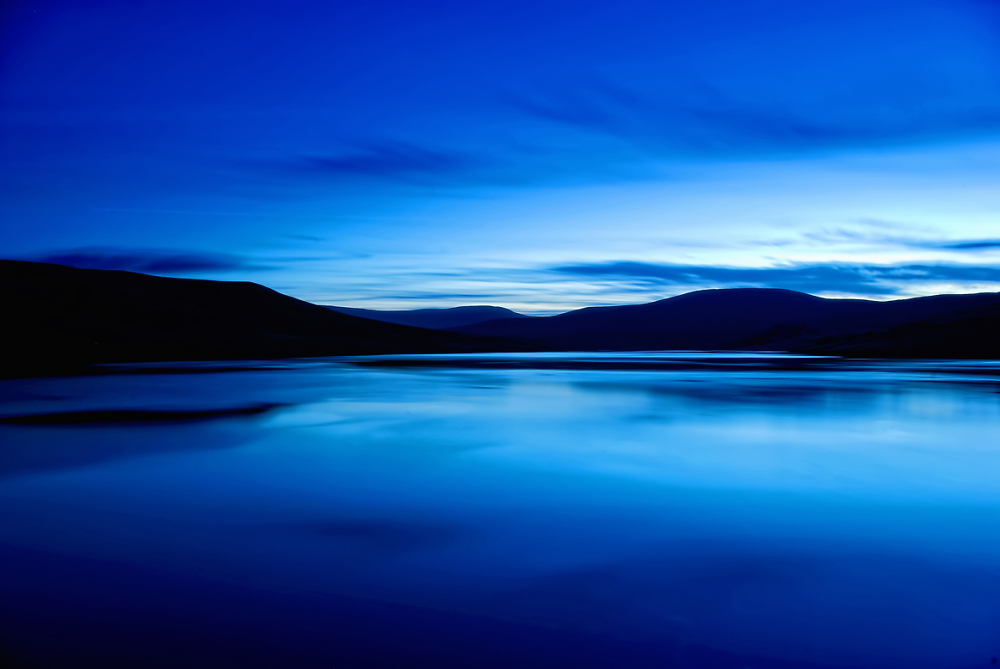
Winning Photograph
Competition Entries
Photographs uploaded to the Weekly Competition #341 - Blue competition.

Posted 27/01/2014 - 05:53
Link
Great judging, and just like the judging should be, thank you so much John.
Congrats to our first and third place winner, lovely shots....but I have to say...I must say... I was passionate about AndrewA portrait...it was a professional and stunning piece of photography! (Whoee, got that off my chest).
Thank you for HC.
JA
Congrats to our first and third place winner, lovely shots....but I have to say...I must say... I was passionate about AndrewA portrait...it was a professional and stunning piece of photography! (Whoee, got that off my chest).
Thank you for HC.
JA

Posted 27/01/2014 - 06:43
Link
Many thanks for the vote John. I also really like AndrewA's portrait and wish it was in my portfolio.
Fletcher8.

Posted 27/01/2014 - 09:06
Link
Thanks to John for an excellent competition and expert judging. Congratulations to Fletcher8, weinelm and AndrewA who occupy the podium and thanks my for HC along with Darlene, JAK and JudithAnn.
David
PPG: http://www.pentaxphotogallery.com/artists/davidtrout
David
PPG: http://www.pentaxphotogallery.com/artists/davidtrout


Posted 27/01/2014 - 10:39
Link
Thanks for the HC John and well done to the podium placements and other HC's. I was surprised how few photos I had that I thought would actually meet the brief, so pleased I found something suitable.
John K

Posted 27/01/2014 - 13:28
Link
Thanks for an excellent competition and expert judging. Also for HC , note well taken. Always like to learn , for more improvement . ( composition has left a bit of a blank area at the bottom of the frame. I'd be inclined to lift the camera to place the bush more strongly, lower down in the frame. ) Congratulations to the winner and other places.

Posted 27/01/2014 - 13:30
Link
Great competition, many thanks John.
Congratulations to our winners and everyone else for a fantastic set of images.
Glyn
Congratulations to our winners and everyone else for a fantastic set of images.
Glyn


Posted 27/01/2014 - 20:43
Link
Thanks to John for comp,some cracking images. well done to Fletcher8 for the win and to podiums and HC's.
All the best.....Jim.
All the best.....Jim.

Posted 27/01/2014 - 22:20
Link
Great images in this comp...
congrats the winner...
Thanks for the judging, John...
take a look at this version of Four Bluebottles which I almost entered, but went with the "straight" version.
The link above takes you to a Redfield Fractalius version that creates a batik effect.
congrats the winner...
Thanks for the judging, John...
take a look at this version of Four Bluebottles which I almost entered, but went with the "straight" version.
The link above takes you to a Redfield Fractalius version that creates a batik effect.
Add Comment
To leave a comment - Log in to Pentax User or create a new account.


24430 posts
24 years
Tyldesley,
Manchester
Sean282: Another entry strong on the blues, and a really fascinating and unusual subject. However, the different shades of blue in the background and the offset composition do feel slightly uncomfortable.
Kh1234567890: A nice diagonal composition makes the picture, as does the interesting subject matter. This one is a bit less blue though, tending more to a blue-green shade. This is pleasing in itself, but I feel doesn't perhaps hit us between the eyes as being blue.
Darlene: I do like the low light feel, the overall blue cast and the feeling of isolation. Snow deadens sound, and this image reinforces in my mind that concept of silence. The composition has left a bit of a blank area at the bottom of the frame. I'd be inclined to lift the camera to place the bush more strongly, lower down in the frame.
cardiff_gareth: We have blue here again, lots of lovely dramatic blue, but most of all a great subject. It's been handled well, although I would have preferred to see all the ripple at bottom right, if at all possible. Very good technique though.
Weinelm: The format is perfect for this elegant, well controlled image. How perfect and serene. The small rock bottom left breaks up the foreground and adds scale. The warm glow of the buildings gives us a superb contrast between the blue and the warmth of habitation. The horizon is also dead level, which is essential for this sort of shot to succeed.
AndrewA: When blue toning works on a portrait it can be highly attractive, as it is here. This is a very sensitive choice of subject and pose. Hands are often a problem, but in this case it works anyway. A highly original and accomplished shot.
Tyronet2000: When I look at this I feel as though I should be looking at the curvature of the earth from orbit. There are two things that distract me though. The first is the warm something that clashed bottom right. The second is the blown out highlight where there are reflections in the fluid. Interesting, but the subject does perhaps need to be less ambiguous.
JAK: This is a pleasing composition and fulfils the brief with lots of blue boats. I like the way the picture curves upwards, pulling our eye through the line of boats.
Simonarron: More vivid blue, which is just what was wanted. The arrangement of the image is very good, just let down I think by the camera being pointed upwards. This has resulted in the buildings all leaning backwards, something that, for me, I would be wanting to modify.
Mowser: I like quirky small buildings and doors and this shot is just the sort of thing I would photograph. It's simple and effective.
Lifespicer: A good arrangement and a great idea to introduce some foliage into the shot. It isn't critically sharp, which I feel the subject would benefit from. A tripod is almost essential for the subject matter.
Davidtrout: A great composition, with a lovely feel to it. It speaks isolation and images that evoke a feeling are all the more worthy for that.
JudithAnn: There's a saying in the UK that “blue and green should never be seen”, but don't believe a word of it. If it were true then the green of the land and blue of the sky would be in big trouble. That intense blue in the vehicle is wrapped in a carpet of green and for once it's a shade of green that is absolutely believable. Adding human interest clinches the fine quality of the image.
Davidstorm: I thought this looked familiar and I've indeed done a similar shot a while ago. It's a captivating subject and I doubt that many photographers would miss it. Here a great job has been done and results in a really good image. Doors always leave us with the unsatisfied urge to know what lies beyond.
GlynM: Primulas are a fantastic shade of blue. These are also pin sharp, which is great, although I wish the plane of sharp focus extended all the way through to the back of the flower group. I really like the composition.
Drofmit: This is a great idea, only slightly spoilt for me by the large area of white in the centre of the frame. This tends to attract the eye to the centre of the frame, which is blank. I do however applaud the ideas within the image.
Gravelrash: I presume there were more bikes around, so you have done an excellent job of showing us a clearly defined subject whilst eliminating any extraneous details.
Geordie01: Light colours attract our attention, so top right a darker button would probably have been better. It might also be advantageous to not have the main button so centrally placed. Notwithstanding those comments we have here another original idea, well planned and executed,
Noelcmn: An unusual bud, enhanced very nicely by the water droplets. Perhaps a more diagonal composition would have been more dramatic, but as it is we still have a relaxing and satisfying image.
Jim-w: Very good idea, just spoilt slightly by the lighter coloured band of light, top right. It is certainly unusual and has that WOW factor in terms of blue.
So, to the winners in a moment, but first a big Thank You to all who entered. Not everyone can win, but I have selected various awards, based purely on image quality and adherence to the brief.
My winner is Fletcher8, with a brilliant and definitely blue landscape. Super work.
Second place goes to weinelm. What a gorgeous image, we could believe that distant fortress to be able to survive for ever, cosseting its inhabitants in a warm glow.
Third place goes to AndrewA for his splendid and innovative portrait.
Highly commended awards to Darlene, JAK, davidtrout and JudithAnn. Really well done to you all, your images were strong contenders for the top placemenmts.
And so ends another Weekly Competition. You guys can pull real quality out of your cameras, it's great to see. Keep up the good work!