Weekly Competition Number 16: Patterns

Posted 28/10/2007 - 01:49
Link
Taken inside the Pantheon in Paris. Wonderful architecture

Exif
File date: 2007:10:27 19:50:13
Camera model: PENTAX K100D
Date/Time: 2007:05:19 12:07:24
Resolution: 1023 x 628
Flash used: No
Focal length: 18.0mm (35mm equivalent: 27mm)
Exposure time: 0.067 s (1/15)
Aperture: f/4.5
ISO equiv.: 400
Whitebalance: Auto
Metering Mode: matrix

Exif
File date: 2007:10:27 19:50:13
Camera model: PENTAX K100D
Date/Time: 2007:05:19 12:07:24
Resolution: 1023 x 628
Flash used: No
Focal length: 18.0mm (35mm equivalent: 27mm)
Exposure time: 0.067 s (1/15)
Aperture: f/4.5
ISO equiv.: 400
Whitebalance: Auto
Metering Mode: matrix
Camera:|K-7|
Pentax Lenses:|DA12-24/f4 ED AL|DA35Ltd Macro|FA31Ltd|FA77Ltd|FA50/1.4|F70-210|FA20-35 f4/AL|A*200/f4 Macro ED|A50/1.7|A50 Macro f2.8|1.7xAF adapter|
Voigtlander|125/f2.5SL Macro APO Lanthar|
Sigma Lenses:|EX DG 100-300 f4|2X & 1.4X TC|
Flashes:|AF540FGZx2|RingFlash AF160FC|
Pentax Lenses:|DA12-24/f4 ED AL|DA35Ltd Macro|FA31Ltd|FA77Ltd|FA50/1.4|F70-210|FA20-35 f4/AL|A*200/f4 Macro ED|A50/1.7|A50 Macro f2.8|1.7xAF adapter|
Voigtlander|125/f2.5SL Macro APO Lanthar|
Sigma Lenses:|EX DG 100-300 f4|2X & 1.4X TC|
Flashes:|AF540FGZx2|RingFlash AF160FC|

Posted 28/10/2007 - 15:12
Link

The photograph isolates and perpetuates a moment of time: an important and revealing moment, or an unimportant and meaningless one, depending upon the photographer's understanding of his subject and mastery of his process. -Edward Weston

Posted 28/10/2007 - 16:29
Link
Nairn town centre, a walkabout with the 105mm Sigma

K10D + Sigma 105mm Macro - f4 @ 1/250 ISO-100

K10D + Sigma 105mm Macro - f4 @ 1/250 ISO-100

Posted 28/10/2007 - 17:36
Link
This one I captured during a recent holiday in Ischia. Taken with K10 + DA40mm f2.8 at f16


Peter
My Flickr page
My Flickr page

Posted 28/10/2007 - 20:50
Link
Never the same...........but still a pattern.
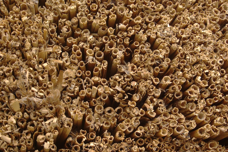
K10D - vivitar 28-80 MF serie 1 - #50mm - f11, iso 100, 1/8 - no flash

K10D - vivitar 28-80 MF serie 1 - #50mm - f11, iso 100, 1/8 - no flash

Posted 29/10/2007 - 00:40
Link


Posted 29/10/2007 - 07:52
Link
First of all let me say there was a good and varied selection of entries here. Some used interpretations of 'patterns' that I hadn't thought of (but which I found pleasing), and a few stretched my own criteria for 'patterns' a little too far.
Due to the nature of the theme any suggestions I make are likely to be more to do with composition, 'effect' and how they fit with my own interpretation of the theme rather than exposure or colour.
Ultimately it comes down to an intangible sense of what the picture is about, and for me it needs to be about a pattern rather than just having a pattern in it.
I'll try to explain in these notes where necessary - and this is the first time I've tried this so I hope I'm doing it right !
justgetoutandride: Certainly a well-observed pattern here, with some interesting shadows to give it more depth. However, the out-of-focus blocks at the top (or is it really the bottom) don't work for me, it becomes unsettling ! Adventurous but not quite there.
lenscape: this is an effective picture of an object, but I find it is more of an object than of a pattern. I know it probably wasn't possible, but I would have found it a better fit for this theme if it had been closer and sharper, to fill the frame with the repeating shapes.
hefty1: I like the square crop and the abstract shapes and colour. Even without repetition it meets my other 'pattern' criteria very well, although not in a way I was actually expecting when I set the theme... Compositionally it 'reads' well, the eye going from the bottom left darker shape up the thread of smoke to the wider cloud. Third Place
johnriley: A good example of a pattern in nature, and well observed. The left-hand cloud shape and the left-hand tree shape are nicely paired. The part that I find less satisfying is where the right-hand branch and cloud coincide, something in my compositional sense jars at that point. I would probably have found it more complete if the right-hand cloud was absent.
dirk1000: A fascinating study of the patterns in the ironwork. The sharpness and the use of monochrome makes it much more graphic and the trees beyond give it depth. However, as far as the theme goes I'm not sure it is predominantly a 'pattern' picture due to the inclusion of the central column and the slightly angled view.
A straight-on shot of one section of the grille might have been 'purer' in terms of this theme.
gartmore: Again an unexpected execution of a pattern, and I like it. I like the composition, the uncluttered nature of it and the use of
the open space around the lights to accentuate the repetition and the overall pattern. The pattern is so regular that the nearest lamp stands
out as being off the line made by the others, which is actually a good thing as it seems to punctuate the sequence. (Or am I reading too much into it ?) First Place
Ammonyte: An interesting picture but I get more 'object' than 'pattern' from it. Compositionally it doesn't give me any strong lines, and the light-coloured area at the centre of the top is distracting if I'm trying to see it as a pattern. I wonder of getting much closer to a group of the shapes would be better for this theme, imagine a crop consisting of a block in the middle of the bottom third of the picture.
Prieni: A good abstract. The colour is dramatic and the composition is strong. From the 'pattern' point of view it is delicate, where maybe I'm looking for a stronger shape or repetition here.
Savem: A dramatic composition of the landscape part, but for me the cloud patterns would work better if they were simpler and more dramatic - they look interesting but they don't give the picture enough punch. More contrast in the clouds might help, but the angled diffuse band of puffier clouds dilutes the pattern and the impact.
Mr. Ist: A very strong picture. I really like the sharp, contrasty nature of it, and the different strengths of straight lines. The round droplets are just so nicely spaced. Second Place
ThePup: Above I've observed more than once the problem where the picture is of an object rather than a picture of a pattern. That's just my feeling about this theme. I suspect that this one falls into the same category as the one from lenscape, the inevitable out-of-focus parts
seem to weaken the 'pattern' aspects.
AlfaFoxtrot: Well-framed and well-timed, this has caught the essence of the display really well. A fine and pleasing picture but I'm
not convinced I can judge it primarily as a pattern.
StrawberryBeret: More of a texture than a pattern, I could see this as wallpaper on a big monitor due to its neutral nature. As a pattern it is too weak for my interpretation of this theme.
Gashley: I like the atmosphere of the shot, and the cold concrete comes through nicely. Only incidentally a pattern picture. The left-hand fence losing definition is slightly distracting, given that the fence wiring is part of the texture of the scene - in fact I see this as a texture picture more than a pattern picture...
Is it that the left-hand fence grid goes below the pixel resolution at this size of picture or is it out of focus ?
amoringello: A classic pattern, bold and bright. The central letters give it a focus, and the way the pattern radiates gives me a headache (only kidding !)
My only reservation is that maybe a central focus is less interesting than some other composition, although it works here. Highly Commended
Clarky: A picture with some patterns in it rather than a pattern in itself. The out-of-focus edge to the bottom left is a little awkward, and the various people and objects dotted around mean I don't see a clear subject other than a general view of the gallery.
drerka: A particularly nice example of textures and shapes. I don't get primarily 'pattern' from it, but an effective picture nonetheless.
Galoot: I like the composition, the repetition and the close crop of the arches and columns. The yellow frames give it a lift as well. Highly Commended
pschlute: A nice regular pattern and texture/colours too. The angle gives it more impact. Overall it doesn't quite do it for me, although I'm not sure why !
Nimitz: Good texture and good feel. Not quite the sort of pattern I was looking for, and would need to be big to really get some impact.
Deecy: Technically outside the competition period at least according to the posting time, and not pattern-oriented enough to do it for me. I found the blurryness of some of the fronds a little distracting.
Well done to everybody !
Due to the nature of the theme any suggestions I make are likely to be more to do with composition, 'effect' and how they fit with my own interpretation of the theme rather than exposure or colour.
Ultimately it comes down to an intangible sense of what the picture is about, and for me it needs to be about a pattern rather than just having a pattern in it.
I'll try to explain in these notes where necessary - and this is the first time I've tried this so I hope I'm doing it right !
justgetoutandride: Certainly a well-observed pattern here, with some interesting shadows to give it more depth. However, the out-of-focus blocks at the top (or is it really the bottom) don't work for me, it becomes unsettling ! Adventurous but not quite there.
lenscape: this is an effective picture of an object, but I find it is more of an object than of a pattern. I know it probably wasn't possible, but I would have found it a better fit for this theme if it had been closer and sharper, to fill the frame with the repeating shapes.
hefty1: I like the square crop and the abstract shapes and colour. Even without repetition it meets my other 'pattern' criteria very well, although not in a way I was actually expecting when I set the theme... Compositionally it 'reads' well, the eye going from the bottom left darker shape up the thread of smoke to the wider cloud. Third Place
johnriley: A good example of a pattern in nature, and well observed. The left-hand cloud shape and the left-hand tree shape are nicely paired. The part that I find less satisfying is where the right-hand branch and cloud coincide, something in my compositional sense jars at that point. I would probably have found it more complete if the right-hand cloud was absent.
dirk1000: A fascinating study of the patterns in the ironwork. The sharpness and the use of monochrome makes it much more graphic and the trees beyond give it depth. However, as far as the theme goes I'm not sure it is predominantly a 'pattern' picture due to the inclusion of the central column and the slightly angled view.
A straight-on shot of one section of the grille might have been 'purer' in terms of this theme.
gartmore: Again an unexpected execution of a pattern, and I like it. I like the composition, the uncluttered nature of it and the use of
the open space around the lights to accentuate the repetition and the overall pattern. The pattern is so regular that the nearest lamp stands
out as being off the line made by the others, which is actually a good thing as it seems to punctuate the sequence. (Or am I reading too much into it ?) First Place
Ammonyte: An interesting picture but I get more 'object' than 'pattern' from it. Compositionally it doesn't give me any strong lines, and the light-coloured area at the centre of the top is distracting if I'm trying to see it as a pattern. I wonder of getting much closer to a group of the shapes would be better for this theme, imagine a crop consisting of a block in the middle of the bottom third of the picture.
Prieni: A good abstract. The colour is dramatic and the composition is strong. From the 'pattern' point of view it is delicate, where maybe I'm looking for a stronger shape or repetition here.
Savem: A dramatic composition of the landscape part, but for me the cloud patterns would work better if they were simpler and more dramatic - they look interesting but they don't give the picture enough punch. More contrast in the clouds might help, but the angled diffuse band of puffier clouds dilutes the pattern and the impact.
Mr. Ist: A very strong picture. I really like the sharp, contrasty nature of it, and the different strengths of straight lines. The round droplets are just so nicely spaced. Second Place
ThePup: Above I've observed more than once the problem where the picture is of an object rather than a picture of a pattern. That's just my feeling about this theme. I suspect that this one falls into the same category as the one from lenscape, the inevitable out-of-focus parts
seem to weaken the 'pattern' aspects.
AlfaFoxtrot: Well-framed and well-timed, this has caught the essence of the display really well. A fine and pleasing picture but I'm
not convinced I can judge it primarily as a pattern.
StrawberryBeret: More of a texture than a pattern, I could see this as wallpaper on a big monitor due to its neutral nature. As a pattern it is too weak for my interpretation of this theme.
Gashley: I like the atmosphere of the shot, and the cold concrete comes through nicely. Only incidentally a pattern picture. The left-hand fence losing definition is slightly distracting, given that the fence wiring is part of the texture of the scene - in fact I see this as a texture picture more than a pattern picture...
Is it that the left-hand fence grid goes below the pixel resolution at this size of picture or is it out of focus ?
amoringello: A classic pattern, bold and bright. The central letters give it a focus, and the way the pattern radiates gives me a headache (only kidding !)
My only reservation is that maybe a central focus is less interesting than some other composition, although it works here. Highly Commended
Clarky: A picture with some patterns in it rather than a pattern in itself. The out-of-focus edge to the bottom left is a little awkward, and the various people and objects dotted around mean I don't see a clear subject other than a general view of the gallery.
drerka: A particularly nice example of textures and shapes. I don't get primarily 'pattern' from it, but an effective picture nonetheless.
Galoot: I like the composition, the repetition and the close crop of the arches and columns. The yellow frames give it a lift as well. Highly Commended
pschlute: A nice regular pattern and texture/colours too. The angle gives it more impact. Overall it doesn't quite do it for me, although I'm not sure why !
Nimitz: Good texture and good feel. Not quite the sort of pattern I was looking for, and would need to be big to really get some impact.
Deecy: Technically outside the competition period at least according to the posting time, and not pattern-oriented enough to do it for me. I found the blurryness of some of the fronds a little distracting.
Well done to everybody !

Posted 29/10/2007 - 07:57
Link
Thank you to karma mechanic for the excellent evaluation and congratulations to all. Yet another superb selection of varied interpretations.
Over to you, gartmore......
Over to you, gartmore......
Best regards, John
Posted 29/10/2007 - 09:02
Link
Well done Karma, excellent evaluation and congats Gartmore.
Camera:|K-7|
Pentax Lenses:|DA12-24/f4 ED AL|DA35Ltd Macro|FA31Ltd|FA77Ltd|FA50/1.4|F70-210|FA20-35 f4/AL|A*200/f4 Macro ED|A50/1.7|A50 Macro f2.8|1.7xAF adapter|
Voigtlander|125/f2.5SL Macro APO Lanthar|
Sigma Lenses:|EX DG 100-300 f4|2X & 1.4X TC|
Flashes:|AF540FGZx2|RingFlash AF160FC|
Pentax Lenses:|DA12-24/f4 ED AL|DA35Ltd Macro|FA31Ltd|FA77Ltd|FA50/1.4|F70-210|FA20-35 f4/AL|A*200/f4 Macro ED|A50/1.7|A50 Macro f2.8|1.7xAF adapter|
Voigtlander|125/f2.5SL Macro APO Lanthar|
Sigma Lenses:|EX DG 100-300 f4|2X & 1.4X TC|
Flashes:|AF540FGZx2|RingFlash AF160FC|

Posted 29/10/2007 - 09:21
Link
Woo-hoo! 3rd place; my best result yet!
Well done everybody, tough call this week although I think I would have picked Gartmore's entry too - reminded me of geese in flight. And well done Karma for judging - nice summary.
Well done everybody, tough call this week although I think I would have picked Gartmore's entry too - reminded me of geese in flight. And well done Karma for judging - nice summary.
Joining the Q


Posted 29/10/2007 - 11:09
Link
Well thanks Karma, I'm 'Bride' at last after being the 'bridesmaid' on quite a few occasions. Seriously, as usual there was stiff competition and well done to everyone who took part and Karma for judging. Next weeks competition is now posted.
Ken
Ken
Ken
“We must avoid however, snapping away, shooting quickly and without thought, overloading ourselves with unnecessary images that clutter our memory and diminish the clarity of the whole.” - Henri Cartier-Bresson -
“We must avoid however, snapping away, shooting quickly and without thought, overloading ourselves with unnecessary images that clutter our memory and diminish the clarity of the whole.” - Henri Cartier-Bresson -
Posted 29/10/2007 - 12:02
Link
Congratulations to gartmore and all the entrants. Thanks to Karma for judging.
Peter
My Flickr page
My Flickr page
Posted 29/10/2007 - 12:02
Link
Congratulations Ken, yours is a meritorious “First Prize” image!
And an excellent judging work from Karma Mechanic. Applauses...
Best regards.
________________
Dirk TROTTEYN.
K10D+ Sigma 18-50 1:2.8 DC Lens.
And an excellent judging work from Karma Mechanic. Applauses...
Best regards.
________________
Dirk TROTTEYN.
K10D+ Sigma 18-50 1:2.8 DC Lens.
Add Comment
To leave a comment - Log in to Pentax User or create a new account.




967 posts
20 years
Virginia,
USA