opinions needed
Posted 13/03/2007 - 19:03
Link
It looks pale and washed out on my screen here.

Posted 13/03/2007 - 19:16
Link
Quote:
It looks pale and washed out on my screen here.
Same here on a calibrated TFT.
It looks pale and washed out on my screen here.
Cheers
Brian.
LBA is good for you, a Lens a day helps you work, rest and play.
Brian.
LBA is good for you, a Lens a day helps you work, rest and play.

Posted 13/03/2007 - 19:52
Link
Thanks for the quick input guys, I suppose its my monitor then!
Dont suppose one of you chaps could play with this in photoshop and let me know what settings you use to bring it up to spec, then I can apply them at this end and try and get some sort of calibration on my monitor.
Dont suppose one of you chaps could play with this in photoshop and let me know what settings you use to bring it up to spec, then I can apply them at this end and try and get some sort of calibration on my monitor.

Posted 13/03/2007 - 20:44
Link
Is this quick modification in Silkypix better? I am still learning the concepts of colour management. The original looked pale on my monitor as well which is profiled with wiziwyg.
I increased the exposure a little, selected V1 colour and increased the saturation a bit. I allso let Silkypix handle the whitebalance. This was a 30 second modification on the image.

I increased the exposure a little, selected V1 colour and increased the saturation a bit. I allso let Silkypix handle the whitebalance. This was a 30 second modification on the image.

Camera:K20D|Ist*DS|Spotmatic II|MZ-10
Pentax Lenses: DA16-45|DA50-200|50A 1.7
Tamron Lenses: 28-200
Takumar Lenses: SMC 55 1.8
Sigma Lenses: EX DG 50-500 'Bigma'|EX 50mm Macro
Flashes: Metz 58 AF-1|Samsung SEF-36PZF|Pentax AF-220T
Pentax Lenses: DA16-45|DA50-200|50A 1.7
Tamron Lenses: 28-200
Takumar Lenses: SMC 55 1.8
Sigma Lenses: EX DG 50-500 'Bigma'|EX 50mm Macro
Flashes: Metz 58 AF-1|Samsung SEF-36PZF|Pentax AF-220T
Posted 13/03/2007 - 21:07
Link
Thanks Golf....
Its definately my monitor, that adjustment of yours looks like the poor little blighter lives near Chernobyl on my screen, colour printoff was OK tho'
Looks like a bit of expenditure is on the way
Its definately my monitor, that adjustment of yours looks like the poor little blighter lives near Chernobyl on my screen, colour printoff was OK tho'
Looks like a bit of expenditure is on the way

Posted 13/03/2007 - 22:16
Link

this one looks ok on my laptop...quick job though, maybe a touch warm..the way I like'em
Fired many shots. Didn't kill anything.

Posted 13/03/2007 - 23:47
Link
Well having seen all these, and only on my old Iiyama 17 inch monitor, I like the first one the best. It looks very natural.
The colours aren't as saturated as in the modified ones (especially golfdiesel's), but which is the most like reality?
It reminds me of the arguments I used to have with my brother (something of a purist, and a very good action photographer, specialising in the Red Arrows and Formula 1) about Konica film.
I used to like it, precisely because the greens were larger than life. On a 6x4 print, the impact of the unrealistic colour saturation compensated for the fact that you were looking at a bit of paper, not a garden.
But I had to concede, it wasn't real.
Similarly, I'd guess that the least modfied image here is the one most like reality, despite it not having the impact of the later ones.

Posted 14/03/2007 - 10:21
Link
Colours look fine for all of them to me. macbook 13" lcd screen. 'calibrated' using mac coloursync.
Please call me aj,
I use a Pentax K10D, on a MacBook with LightRoom (vers 1.3 + beta 2)
http://www.ba-joseph.co.uk/gallery
I use a Pentax K10D, on a MacBook with LightRoom (vers 1.3 + beta 2)
http://www.ba-joseph.co.uk/gallery

Posted 14/03/2007 - 16:17
Link
on a no-name 19" lcd Claxan, I find the third one too dark, the second one quite nice, but I have to agree the first is the best on my monitor. It also depends on what you like! My preference would be number two as it looks sharper on my monitor. However I prefer the colours on the first one. The interesting question for me on all these is how close they are to original as seen by the photographer. As someone else says, we could talk around those subjects for days on end.

Posted 14/03/2007 - 22:32
Link
I'd say that the original looks the truest-to-life, if not the most satisfying on my Dell 19" CRT calibrated by my mate Huey.
Posted 14/03/2007 - 23:21
Link
Oh dear, a few conflicting opinions, I may have to look further than problems with my monitor .
As I said, I thought the image looked OK on my monitor but it just printed off pale in comparison, and thats on an Epson which are renowned for printing on the dark side.
Funny thing is, I have since tried printing other images and they seem ok when compared to the image on screen, I'm begining to wonder if its the printer that cant handle the yellows?
Posted 16/03/2007 - 19:15
Link
I'm having similar problems - and I was wondering if anyone would be able to suggest why. I'm using raw, and converting in Adobe camera raw. The only thing is, the preview in ACR that one uses to tune the image is wildly different (saturation wise) from the jpeg I see later on in windows explorer (exploder?). I've done my best to calibrate my laptop screen with adobe gamma, but in this situation it seems as though the programs are using different profiles or something. Could this be the case :
Can anyone help me out?
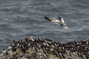
p.s the second bird looks best to me - even though my monitor may not be calibrated properly
Can anyone help me out?
p.s the second bird looks best to me - even though my monitor may not be calibrated properly
Posted 16/03/2007 - 20:29
Link
windows explorer seems to give totally different results then photoshop for example.
Camera:K20D|Ist*DS|Spotmatic II|MZ-10
Pentax Lenses: DA16-45|DA50-200|50A 1.7
Tamron Lenses: 28-200
Takumar Lenses: SMC 55 1.8
Sigma Lenses: EX DG 50-500 'Bigma'|EX 50mm Macro
Flashes: Metz 58 AF-1|Samsung SEF-36PZF|Pentax AF-220T
Pentax Lenses: DA16-45|DA50-200|50A 1.7
Tamron Lenses: 28-200
Takumar Lenses: SMC 55 1.8
Sigma Lenses: EX DG 50-500 'Bigma'|EX 50mm Macro
Flashes: Metz 58 AF-1|Samsung SEF-36PZF|Pentax AF-220T

Posted 16/03/2007 - 20:41
Link
Photoshop has a colour profile, perhaps Windows Explorer doesn't?
Best regards, John
Add Comment
To leave a comment - Log in to Pentax User or create a new account.
6378 posts
19 years
Leeds,
UK
What I need to know is how it appears on your monitors.
My PPG link
My Flckr link