


Is this an OK B&W conversion

Posted 21/08/2009 - 15:55
Link
Hi MIke,
I find the conversion a bit flat, not really contrasty enough, and not particulary significative.
But what hurts the most is the fact that the original in colour is such a gorgeous picture, that I would never consider desaturating. Why don't you work just a little bit on the colour version, it will give you a much more pleasent result.
Good stuff


Posted 21/08/2009 - 16:08
Link
have to agree with nathan, colour is the way to go would have been happy to have taken it, or much more contrast to bring out the wheat at the front from the rest.
Posted 21/08/2009 - 16:16
Link
I was fairly happy to have taken it but irritated that I hadn't realised how close I was to the foreground stalk and was wondering why I couldn't get an AF lock. I was using the Sigma 10-20 and that main stalk was really close - too close drat it.
It was the cloud that caught me eye and then the field that seemed to be ideal. However, it was on the side of a hill which isn't obvious so in fact to make the shot look right I had to shoot at an angle to negate that slope.
Mike
It was the cloud that caught me eye and then the field that seemed to be ideal. However, it was on the side of a hill which isn't obvious so in fact to make the shot look right I had to shoot at an angle to negate that slope.
Mike
---------------------------------------------------
You can see some of my shots at my Flickr account.
You can see some of my shots at my Flickr account.


Posted 21/08/2009 - 16:32
Link
The actual process was:
Copy the layer
desaturate top layer (can use your favourite conversion method)
Increase contrast of top layer
sharpen top layer (to give a local contrast boost)
Set top layer mode to "overlay" or "luminosity"
Reduce top layer opacity to 50% or so
Merge layers
It's tricky finding a balance using a small picture & I've overdone the contrast.
I'd be tempted to add a slight vignette too, would add to the black clouds.

Posted 21/08/2009 - 16:34
Link
Prefer the colour, but why have you flipped it?
Cheers,
Howard
Cheers,
Howard
Cymru Am Byth
Posted 21/08/2009 - 16:35
Link
I flipped it because I was messing about try to stitch the colour and B&W into one image which looked pretty awful
Do you prefer the contrasty colour to the initial one?
Mike
Do you prefer the contrasty colour to the initial one?
Mike
---------------------------------------------------
You can see some of my shots at my Flickr account.
You can see some of my shots at my Flickr account.
Posted 21/08/2009 - 16:42
Link
Well all I did was whack up the contrast and tone down the saturation using new layers on the background. I wasn't sure why (or how it has to be said) you duplicated the background layer and then worked on that separate to the initial background layer.
I wish I didn't spell the as teh every bloody time.
Mike
How does this look?

Some localised desaturation on wheat.
I wish I didn't spell the as teh every bloody time.
Mike
How does this look?
Some localised desaturation on wheat.
---------------------------------------------------
You can see some of my shots at my Flickr account.
You can see some of my shots at my Flickr account.
Posted 21/08/2009 - 16:52
Link
It's a process I've been playing with, but I generally desaturate a little more & cross process colours. I've got an application in mind for the technique so I'm having a play around.
You can duplicate a layer in the "layer" menu at the top, then experiment with layer modes.
Bob
I like that last version, but then I'm a sucker for contrast & I'm sure many will disagree.
You can duplicate a layer in the "layer" menu at the top, then experiment with layer modes.
Bob
I like that last version, but then I'm a sucker for contrast & I'm sure many will disagree.
Add Comment
To leave a comment - Log in to Pentax User or create a new account.


3241 posts
16 years
Worcestershire
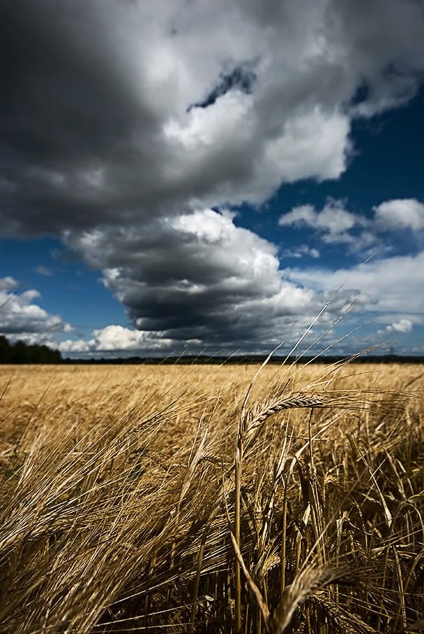
First the colour version
Then my B&W conversion - is it OK?
All advice welcomed.
Mike
You can see some of my shots at my Flickr account.