Interesting BW conversion technique

Posted 25/07/2009 - 13:37
Link
Thanks for the link, John. A lot of black-and-white conversions we see don't quite work and it's often difficult to decide why. This approach seems to be one way of coming closer to the "feel" of B&W film. Looks like a good project for the dark winter nights.
Al
Al

Posted 25/07/2009 - 13:53
Link
That's a very good conversion and a great link - thanx for sharing, I do do a similar technique but not quite so refined, I shall play with this tonight
ps- BTW, IMHO it wd be stonger if you cropped it selectively
pps- a very interesting website too, www.fredmiranda.com
ps- BTW, IMHO it wd be stonger if you cropped it selectively
pps- a very interesting website too, www.fredmiranda.com
Posted 25/07/2009 - 15:13
Link
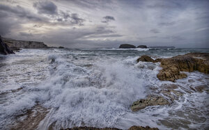
I had a go at the above mentioned B&W conversion method, for C&C re results can you say which one you prefer out of A,B,C ..please.
Lilly
Started with this jpeg, out of the camera:
[IMG]http://i168.photobucket.com/albums/u193/lillymermaid/2009-04-coastwalk_0079.jpg[/IMG]
A)
[IMG]http://i168.photobucket.com/albums/u193/lillymermaid/2009-04-coastwalk_0079a.jpg[/IMG]
B)
[IMG]http://i168.photobucket.com/albums/u193/lillymermaid/2009-04-coastwalk_0079b.jpg[/IMG]
C)
[IMG]http://i168.photobucket.com/albums/u193/lillymermaid/2009-04-coastwalk_0079b.jpg[/IMG]
I will interested to see which one comes out top for my own experiment and will reveal all!
Lilly
Lilly
Started with this jpeg, out of the camera:
[IMG]http://i168.photobucket.com/albums/u193/lillymermaid/2009-04-coastwalk_0079.jpg[/IMG]
A)
[IMG]http://i168.photobucket.com/albums/u193/lillymermaid/2009-04-coastwalk_0079a.jpg[/IMG]
B)
[IMG]http://i168.photobucket.com/albums/u193/lillymermaid/2009-04-coastwalk_0079b.jpg[/IMG]
C)
[IMG]http://i168.photobucket.com/albums/u193/lillymermaid/2009-04-coastwalk_0079b.jpg[/IMG]
I will interested to see which one comes out top for my own experiment and will reveal all!
Lilly

Posted 25/07/2009 - 15:46
Link
I vote for A, but it still needs tweaking as the sea is a little dark. The sky is much better though, showing none of the striation that's visible in the other two. There is also more contrast where the detail gives the image its impact.
Best regards, John

Posted 25/07/2009 - 15:58
Link
I prefer C as to me the subject is the sea. I would prefer a combination of the sky in A & the sea in C if that were achievable.
Technical competence doesn't always equate to aesthetic appeal though. Sometimes it's just personal preference that's wins out.
They all look better that anything I've converted to B&W so far.
Caz
Technical competence doesn't always equate to aesthetic appeal though. Sometimes it's just personal preference that's wins out.
They all look better that anything I've converted to B&W so far.
Caz
"IF YOU OBEY ALL THE RULES, YOU MISS ALL THE FUN." - KATHERINE HEPBURN

Posted 25/07/2009 - 16:40
Link
B for me but I like c too.
Ken
Ken
Ken
We must avoid however, snapping away, shooting quickly and without thought, overloading ourselves with unnecessary images that clutter our memory and diminish the clarity of the whole. - Henri Cartier-Bresson -
We must avoid however, snapping away, shooting quickly and without thought, overloading ourselves with unnecessary images that clutter our memory and diminish the clarity of the whole. - Henri Cartier-Bresson -

Posted 25/07/2009 - 17:11
Link
I'd say C as it looks the more truthful B&W conversion from the original then B. Aesthetically I think it's still C as you have more tones in there. Then again you've lost something in the surf over the seaweed in C compared to B.
I too shall try this technique!
Mike
I too shall try this technique!
Mike
---------------------------------------------------
You can see some of my shots at my Flickr account.
You can see some of my shots at my Flickr account.

Posted 25/07/2009 - 18:40
Link
C for me. There is more fine detail in the cliff faces, particularly the cliffs in the far distance. The 3rd picture looks smoother on my monitor than the other two.
To get back to John's original image I think you have some lovely tones in the old stonework which would be worth looking at in a tighter crop.
david
To get back to John's original image I think you have some lovely tones in the old stonework which would be worth looking at in a tighter crop.
david

Posted 25/07/2009 - 19:59
Link
That's interesting - I can't see any difference at all between the last 2.
Not keen on any of them really, except 1! Not sure it is the right picture for BW.
Not keen on any of them really, except 1! Not sure it is the right picture for BW.

Posted 25/07/2009 - 20:21
Link
C is my favourite. Presume all the methods rely on a bit of user control, which adds a variable which makes it hard to say how much is down to the general technique!
My bugbear with B&W conversion is blotchy noise, and non-smooth gradations in tones, in skies. At the size you have posted these issues aren't visible though; although C is smoother overall which looks encouraging.
My bugbear with B&W conversion is blotchy noise, and non-smooth gradations in tones, in skies. At the size you have posted these issues aren't visible though; although C is smoother overall which looks encouraging.
Posted 25/07/2009 - 20:22
Link
Darkmunk wrote:
That's interesting - I can't see any difference at all between the last 2.
Not keen on any of them really, except 1! Not sure it is the right picture for BW.
I'd say the main differences I can see are the distant cliffs as has been mentioned and the detail in the sand and the surf.That's interesting - I can't see any difference at all between the last 2.
Not keen on any of them really, except 1! Not sure it is the right picture for BW.
But how much of this is monitors?
Mike
---------------------------------------------------
You can see some of my shots at my Flickr account.
You can see some of my shots at my Flickr account.

Posted 25/07/2009 - 23:10
Link
I am astonished at how different the sky looks in A, compared to the other two.
Personally I think the subject is a bit too contrasty, and works better in colour. But if I had to choose one, it would be B.
G
Personally I think the subject is a bit too contrasty, and works better in colour. But if I had to choose one, it would be B.
G
Keywords: Charming, polite, and generally agreeable.
Posted 25/07/2009 - 23:13
Link
The subtle differences are:
a) Used the method in the mentioned link from step 1 - 9
b) used the same steps 1 - 9 but before starting did as PEANO suggests and set the bk & we points in a curve adjustment layer.
Plus, added a gradient filter to beef up the blank sky which JR referred to as banding, not a good adjustment after all maybe.
c) this method was computer gererated without any human adjustments
I used a SW that I have recently aquired called SFXwhere you just select which preset you wish from a preview and then which 35mm film effect you prefer.
And added the gradient filter to beef up the blank sky which JR referred to as banding, not a good adjustemnt after all maybe.
I actually prefer 'c' also, but did enjoy doing it by way suggested and will refine it more with practice as it does open up another interpretation of conversion. I do still feel more comfy with my adjustment layers for dodging and burning to bring out the drama of b&w.
Anyway, onwards and upwards
Lilly
Posted 25/07/2009 - 23:38
Link
oh and the tittivated colour version
[IMG]http://i168.photobucket.com/albums/u193/lillymermaid/2009-04-coastwalk_0079d.jpg[/IMG]
[IMG]http://i168.photobucket.com/albums/u193/lillymermaid/2009-04-coastwalk_0079d.jpg[/IMG]
Add Comment
To leave a comment - Log in to Pentax User or create a new account.
14 posts
17 years
Mula,
Murcia,
España
just found this interesting technique for B&W conversion
http://www.fredmiranda.com/forum/topic/789002
gave it a try, here are my results
Body...K20D, K100D,
Prime lens..50mm F1.7
Zoom lens...18-55mm F3.5-5.6 AL, smc P-A 80-200mm, smc P-M 40-80mm
Phase One Capture One Pro 4.8