Iceland

Posted 05/08/2010 - 18:46
Link


Posted 05/08/2010 - 19:15
Link
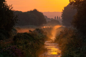
Thats a very dramatic landscape. The adjusted version has much more impact.
David
David


Posted 05/08/2010 - 20:04
Link
And from me
Colin
“Nobody made a greater mistake than he who did nothing because he could do only a little.”
Edmund Burke (1729 – 1797)
[IMG]http://i941.photobucket.com/albums/ad254/weldingblues/K-7userbar-red.jpg[/IMG]
“Nobody made a greater mistake than he who did nothing because he could do only a little.”
Edmund Burke (1729 – 1797)
[IMG]http://i941.photobucket.com/albums/ad254/weldingblues/K-7userbar-red.jpg[/IMG]

Posted 05/08/2010 - 21:11
Link
{throws caution to the winds} I'm going to say I prefer the first. I know that 'impact-wise' Jon and SnappyChappy's reworks have more 'gusto', but, having been to Iceland, I've gotta say, they're both wrong! They make the scene look like something 'British Countryside' - especially Jon's, which is very green-fields and sun breaking through the clouds.
But for me, the single most undeniable thing about Iceland, was how bleak it was. The whole island is like the surface of the flippin' moon! It's a cross between a volcanic hell and a low-contrast ashen slagheap spread liberally across a rocky outcrop - with a fair few other-worldly glaciers and hot-water and steam geysers adding the general feeling of being on a different planet!
And for those reasons, I think the existing colours in Dave's original are right. Perhaps the contrast could be increased a touch, but not too much, really. Iceland is grungily grey, for the most part! To the extent where this might've actually been better done in monochrome, and some brightening done only on the two geysers in the shot, leaving the rest as, effectively, a 'moon shot'.
Sorry to buck the trend - I do fully accept that Jon's version is a 'better photo', in the classic sense, but for me, it's less 'real'. If I didn't know this was Iceland (am I right in thinking this is at or near the Blue Lagoon, btw?) then Jon's would've been fine - but alas, I do. And I recommend a trip there, for anyone interested... it really is the closest landscape you'll ever find on Earth, to being 'outer space!'
But for me, the single most undeniable thing about Iceland, was how bleak it was. The whole island is like the surface of the flippin' moon! It's a cross between a volcanic hell and a low-contrast ashen slagheap spread liberally across a rocky outcrop - with a fair few other-worldly glaciers and hot-water and steam geysers adding the general feeling of being on a different planet!
And for those reasons, I think the existing colours in Dave's original are right. Perhaps the contrast could be increased a touch, but not too much, really. Iceland is grungily grey, for the most part! To the extent where this might've actually been better done in monochrome, and some brightening done only on the two geysers in the shot, leaving the rest as, effectively, a 'moon shot'.
Sorry to buck the trend - I do fully accept that Jon's version is a 'better photo', in the classic sense, but for me, it's less 'real'. If I didn't know this was Iceland (am I right in thinking this is at or near the Blue Lagoon, btw?) then Jon's would've been fine - but alas, I do. And I recommend a trip there, for anyone interested... it really is the closest landscape you'll ever find on Earth, to being 'outer space!'
Neil
≡≡≡≡
Pentax K-x ♥ Pentax DA L 18-55mm f3.5-5.6 AL ♣ Pentax DA L 55-300mm f4-5.8 ED ♦ Pentax A 50mm f2.0 ♠ Pentax AF360FGZ flash ♥ Rikenon P 50mm f1.7 ♣ Vivitar CF 28mm f2.8 (K02 Komine) ♦ Tokina 80-200mm f4 ♠ Vivitar MC 2x22 Tele Converter
"Rules are for the obedience of fools and the guidance of wise men" - Douglas 'Tin-Legs' Bader
≡≡≡≡
Pentax K-x ♥ Pentax DA L 18-55mm f3.5-5.6 AL ♣ Pentax DA L 55-300mm f4-5.8 ED ♦ Pentax A 50mm f2.0 ♠ Pentax AF360FGZ flash ♥ Rikenon P 50mm f1.7 ♣ Vivitar CF 28mm f2.8 (K02 Komine) ♦ Tokina 80-200mm f4 ♠ Vivitar MC 2x22 Tele Converter
"Rules are for the obedience of fools and the guidance of wise men" - Douglas 'Tin-Legs' Bader

Posted 05/08/2010 - 21:25
Link
I've never been to Iceland, but I prefer the original too. The adjusted version looks a little too unnatural to be true.

Posted 05/08/2010 - 21:33
Link
What a place...imagine being there. The pictures, the pictures...
Best wishes,
Andrew
"These places mean something and it's the job of a photographer to figure-out what the hell it is."
Robert Adams
"The camera doesn't make a bit of difference. All of them can record what you are seeing. But, you have to SEE."
Ernst Hass
My website: http://www.ephotozine.com/user/bwlchmawr-199050
http://s927.photobucket.com/home/ADC3440/index
https://www.flickr.com/photos/78898196@N05
Andrew
"These places mean something and it's the job of a photographer to figure-out what the hell it is."
Robert Adams
"The camera doesn't make a bit of difference. All of them can record what you are seeing. But, you have to SEE."
Ernst Hass
My website: http://www.ephotozine.com/user/bwlchmawr-199050
http://s927.photobucket.com/home/ADC3440/index
https://www.flickr.com/photos/78898196@N05
Posted 05/08/2010 - 22:24
Link
Quote:
(am I right in thinking this is at or near the Blue Lagoon, btw?)
Sorry Neil,(am I right in thinking this is at or near the Blue Lagoon, btw?)
It`s actually east of Myvatn. a godforsaken ( but wonderful ) place if ever there was one.
Davex.
Posted 05/08/2010 - 23:10
Link
Very interesting comments by Neil and I can see where he is coming from. It is something I actually considered when I went to Ascnsion Island, another volcanic landscape. In the end I decided I wanted images with more impact than they had sttraight out of the camera, so I adjusted levels, contrast and sometiimes saturatioon to get the images lookking more interesting than the drab grey that makes up much of the island.
It brings up the question whether photgraphy is about faiithfully recording something or making a pleasing image? If the former, then where do mono image fit in?
I would however say that Dr Orloffs reasoon for preferring the original is perfectly valid, even though in some ways it amounts to much the same thing: the difference being he is not assessing the image from actual knowledge of the subject matter.
It brings up the question whether photgraphy is about faiithfully recording something or making a pleasing image? If the former, then where do mono image fit in?
I would however say that Dr Orloffs reasoon for preferring the original is perfectly valid, even though in some ways it amounts to much the same thing: the difference being he is not assessing the image from actual knowledge of the subject matter.
Posted 06/08/2010 - 07:33
Link
Quote:
whether photography is about faithfully recording something or making a pleasing image?
This has come up a couple of times with images from Iceland i have recently posted, perhaps the colours are so unusual it makes us almost subconsciously go into abstract mode, which encourages us to boost saturation and contrast.whether photography is about faithfully recording something or making a pleasing image?
Davex.

Posted 06/08/2010 - 08:34
Link
BigJacko wrote:
I'm going to say I prefer the first.
Me too, FWIW.
I'm going to say I prefer the first.
.
Pentax K-3, DA18-135, DA35 F2.4, DA17-70, DA55-300, FA28-200, A50 F1.7, A100 F4 Macro, A400 F5.6, Sigma 10-20 EXDC, 50-500 F4.5-6.3 APO DG OS Samsung flash SEF-54PZF(x2)
.
Pentax K-3, DA18-135, DA35 F2.4, DA17-70, DA55-300, FA28-200, A50 F1.7, A100 F4 Macro, A400 F5.6, Sigma 10-20 EXDC, 50-500 F4.5-6.3 APO DG OS Samsung flash SEF-54PZF(x2)
.
Add Comment
To leave a comment - Log in to Pentax User or create a new account.



1432 posts
17 years
Chester,
U.K.
feel free to play
Please feel free to play with any images I post.
My flickr: link