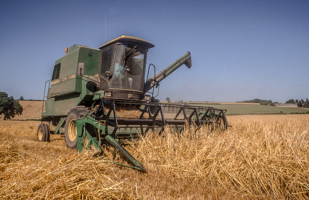
Harvest time in Somerset.

Posted 13/08/2026 - 13:19
Link
Crying out for colour, B&W never works for scenes like these.
B&W only works when the colour photo would make people think it is a B&W photo, e.g. a photo of concrete steps taken on a sunny day so that the concrete looks white and the shadow looks black. There are other examples.
B&W only works when the colour photo would make people think it is a B&W photo, e.g. a photo of concrete steps taken on a sunny day so that the concrete looks white and the shadow looks black. There are other examples.
Pentax K1-ii and MZ6
Pentax Lenses 28-80 F, 300 DA*, 80-200 F, 35 F2.4 AL, M50 F1.7, 28-105 DFA, 20 F4 SMC
ONE UNITED Member
Pentax Lenses 28-80 F, 300 DA*, 80-200 F, 35 F2.4 AL, M50 F1.7, 28-105 DFA, 20 F4 SMC
ONE UNITED Member

Posted 13/08/2026 - 21:13
Link
The mono shots look good but a red or green combine on a field of golden wheat would be fantastic.

Posted 13/08/2026 - 21:18
Link
I'm a big Mono fan, and these are very good mono shots, but I have to agree that the colours of summer are crying out to be seen
LennyBloke
Posted 14/08/2026 - 03:53
Link
Endorse above comments. I think the colour version posted in Gallery section does full justice to the subject.

Posted 14/08/2026 - 14:33
Link
Thanks for your comments. This is for comparison!!!

Posted 14/08/2026 - 16:46
Link
Of course, in a land a long time ago, known only to the ancient ones, all photos were B&W and seeing the colours of summer was not an option. Did people subconsciously associate appropriate colours with different items in the photo since they only ever saw B&W photos? Have we changed from 'colour is B&W with colour added' to 'B&W is colour with colour removed'?
Sorry about going philosophical on a Friday afternoon. I've just walked a couple of miles in the peak heat and my brain is boiling!
Steve
Sorry about going philosophical on a Friday afternoon. I've just walked a couple of miles in the peak heat and my brain is boiling!
Steve

Posted 14/08/2026 - 23:58
Link
Quote:
Did people subconsciously associate appropriate colours with different items in the photo since they only ever saw B&W photos?
That's an interesting thought. I don't think it arises, and we see tones and shapes and colour doesn't come into it. Perhaps because for most items we don't actually know what colour exactly or perhaps because the composition and tonal values in black and white carry the message and colour is irrelevant if it's done properly?
Did people subconsciously associate appropriate colours with different items in the photo since they only ever saw B&W photos?
Best regards, John
Posted 15/08/2026 - 16:26
Link
I didn't intend to start a philosophical discussion about BW and colour. I converted to BW because I thought that it hid the fact that this rather old combine was not in pristine condition (unlike the one in the gallery which was brand new)... no deep philosophical thinking involved!!
Thanks for your comments,
Graham
Thanks for your comments,
Graham

Posted 16/08/2026 - 10:26
Link
I think these look great in B/W, in colour you lose the high contrast which makes the machinery stand out.
Add Comment
To leave a comment - Log in to Pentax User or create a new account.



240 posts
7 years
York.
Taken on Fuji colour transparency film with a Pentax Program A.