B&W Conversion

Posted 31/05/2006 - 11:27
Link
The clouds have come out really well, but I think you need to lighten the sea and the beach.
Where's Matt whn you need him?
G
Where's Matt whn you need him?
G
Keywords: Charming, polite, and generally agreeable.

Posted 31/05/2006 - 12:22
Link
Quote:
Where's Matt whn you need him?
Probably working Where's Matt whn you need him?
Had a quick hack at this
Here's my take:
* Channel mixer: mono, Red+50, Green+40, Blue+10
* Added a curve layer, In136, Out64. Then used gradient tool to mask all but the clouds (so only the clouds were darkened)
* Selective Color layer: Whites=Black-46, Neutrals=Black-2, Blacks=Black+0
Pretty much it.
BUT: A nice tip from me
* Add a solid color layer on top, bright red. Layer/LayerStyle/BlendingOptions - where you see "Blend If", pull the black triangle of "Underlying Layer" up to 253 (ie nearly all the way to the right)
* Add a solid color layer on top, bright blue. Layer/LayerStyle/BlendingOptions - adjust WHITE triangle of the "Underlying Layer" to 2 (nearly all the way to the left)
Now - group the two layers in a set if you want. The RED layer is your BLOWN HIGHLIGHTS, and the BLUE layer is your LOST SHADOWS.
Keep those two layers on top while you adjust the B&W conversion so at least you know what you're missing
Oh yes, and a final ZONE SYSTEM tip:
* Add Gradient Map on top, pick "Gray Value Stripes"
* Check you can still see the detailing in the B&W (adjust curves underneath if needed)
* Turn off the layer when you're happy
- that little trick shows whether you are getting the best detail out of your B&W.
EDIT: Image here: http://upload.pbase.com/image/61080894
Hope that helps!!!
Matt
Posted 31/05/2006 - 12:28
Link
Ok, Matt, but a picture is worth a thousand words. Hint, hint.
G
G
Keywords: Charming, polite, and generally agreeable.
Posted 31/05/2006 - 12:30
Link
Give me a chance George! LOL!
http://upload.pbase.com/image/61080894
(Did tweak the curves a little bit more too)

Oh yeah, add grain and diffuse glow to taste...
Matt
http://upload.pbase.com/image/61080894
(Did tweak the curves a little bit more too)

Oh yeah, add grain and diffuse glow to taste...
Matt
Posted 31/05/2006 - 12:35
Link
Thanks for that Matt - that's very interesting. Your version still has plenty of impact but without losing some of the shadow detail which happened in my version. Mine looks a bit harsh by comparison as well.
I'll follow your instructions and see how I get on!
Cheers
Steve
I'll follow your instructions and see how I get on!
Cheers
Steve
Posted 31/05/2006 - 12:40
Link
Thanks George
Niblue - let me know if you get stuck anywhere...
Niblue - let me know if you get stuck anywhere...
Posted 01/06/2006 - 12:27
Link
I'm still practising however I think my B&W conversions are getting better. A few I've just done are on my Black & White page at:
http://www.pbase.com/niblue
http://www.pbase.com/niblue
Posted 02/06/2006 - 01:15
Link
Steve,
I've had a look at your latest version, and it is a vast improvement on your first effort. In my view, Matt's effort is slightly better, but that is largely subjective, and anyway he's had bags of experience.
One of these days I'm going to do a course in digital photo manipulation. All I need is time.
G
Keywords: Charming, polite, and generally agreeable.
Posted 02/06/2006 - 09:42
Link
George - thanks for that. Matt is miles better at this sort of thing than I am, however I've already learned a lot from this thread and the IR one.
I'm using Elements 4 on my home PC but for the last few conversions I've been using a trial install of CS2 on my office PC. I'm finding CS2 is way better for B&W conversions, so much so that I'm now considering buying a full copy.
I'm using Elements 4 on my home PC but for the last few conversions I've been using a trial install of CS2 on my office PC. I'm finding CS2 is way better for B&W conversions, so much so that I'm now considering buying a full copy.
Posted 02/06/2006 - 09:51
Link
Actually, PSE4 is pretty excellent at B&W conversions too... if you know how to leverage it
Yes, CS2 is seriously good, but I would encourage you to learn with PSE4 first...
Try this:
* Add a new adjustment layer - Hue/Saturation - set Saturation to -100
* Change the layer blend mode to "Color"
This is mind-blowingly simple. When you have "Normal" blend mode the B&W conversion is performed with each colour having the same "weight" in greyscales. But this isn't how the eye sees it. Changing the blend mode to "Color" will switch to almost Lab mode and provide a visually correct version where yellows appear brighter than blues in the B&W.
Try this (known as Russell Brown's B&W technique):
* Add a new adjustment layer - Hue/Saturation (leave values as-is)
* Set the layer blend mode to "Color"
* Add another adjustment layer - Hue/Saturation - set Saturation to -100
Now you've got black and white... but... double click the middle layer and tweak the "Hue". This has the effect of a filter with B&W film You can also, amazingly, select the range from within this to adjust just one colour range.
Of course, you can blend the two techniques. And you can still add a gradient layer on top!
For Elements I can recommend www.hiddenelements.com - theres some plugins for PSE that extend its abilities, such as opening up Curves, Layer Masks and some other goodies. Just checked - and there's a download that adds Channel Mixer, Layer Masks, Color Separation etc etc. Not bad for $15. And the book is where I learnt most of my "Photoshop hackery" from
Have fun!!
Matt
Posted 02/06/2006 - 09:52
Link
Here's one I'm still working on. This is the original colour shot:

There are a few problems with it:
Wonky horizon - a problem I often have
A light leak at the top and bottom. I think this film was shot and left unprocessed for several years - a shame because there are some good (for me anyway!) shots on it.
With the horizon fixed in Photoshop, cropped and converted to B&W it now looks like this:

I still need to sort out the remaining light patch at the top left corner, and I've yet to decide whether to leave the grain - even so I already like to result.
Posted 02/06/2006 - 10:00
Link
You can sort out lighting this way:
* Add a new layer
* Change the blend mode to "Multiply" (that will darken things)
* Pick the Gradient tool
- Choose the gradient "Foreground to transparent"
- Set the opacity to 10% or 20%
- Set black as the foreground colour
- Pick the linear gradient
* Now carefully brush from the top down at the angle of the highlight
Other blend modes can be used:
* Soft-Light - useful for gentle dodging & burning. Black will darken, White will lighten
* Overlay - as above, but more intense.
And you can do this with Elements too
Matt
Posted 02/06/2006 - 10:54
Link
Thanks again Matt. Here's the latest version with the light area fixed.


Add Comment
To leave a comment - Log in to Pentax User or create a new account.
829 posts
20 years
Edinburgh
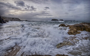
Here's a colour image I took recently (nothing special - just a holiday snap):
And here's my current best effort at a B&W conversion:
Anyone fancy having a go at doing a better job and explaining the technique they've used?
Regards
Steve